The Added Significance Of Multiple Email Opens

How are you measuring the effectiveness of your email marketing? You’re looking at open and click-through rates (CTRs), no doubt. But recent research suggests that multiple email opens may have added significance. 

Failure to understand multiple email opens could result in an under-assessment of the appeal of your emails. This is particularly germane for those of you who pay advertising partners for email blasts.

We’ll get into it below but fair warning: This delves into a fuzzy area of email campaign performance measurement.

Finserv Content Isn’t So Easily Dealt With

For the last few years, data has shown that mobile devices are being increasingly used to read emails. And, email marketers have made design, layout, content and even functional (e.g., click to call) adjustments to drive opens and click-throughs on smartphones and tablets.

Mobile devices are an efficient way of using stolen moments on the go to stay on top of an Inbox. But not every email—and I’m thinking of investment management offers of whitepapers or videos here—can be dealt with so quickly or easily while on a phone.

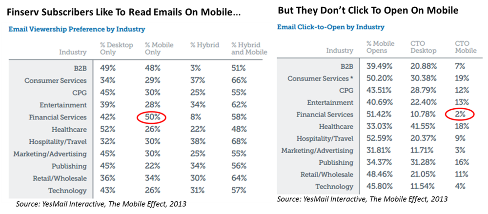
In fact, YesMail last year reported some interesting data on financial services emails in general (probably not asset manager emails sent to financial advisors) accessed on mobile devices. While financial services email subscribers topped the list of industry email subscribers who preferred to view emails on mobile, it was at the very bottom of the list of those who clicked to open on mobile.

A 'New Standard' Of Engagement

In this latest report, email provider Campaign Monitor is highlighting a new email consumption habit it refers to as “triaging”—aka flagging the good ones to be read later, possibly on a different device. A triaged email was opened, not clicked through then and there, but possibly saved to be read again later.

“The shift to mobile has made it more difficult to get readers to engage with your content...The new standard in successful email marketing is not only capturing a subscriber’s attention but holding it long enough to get them to return and engage with your content,” says Campaign Monitor in its Email Marketing Trends report.

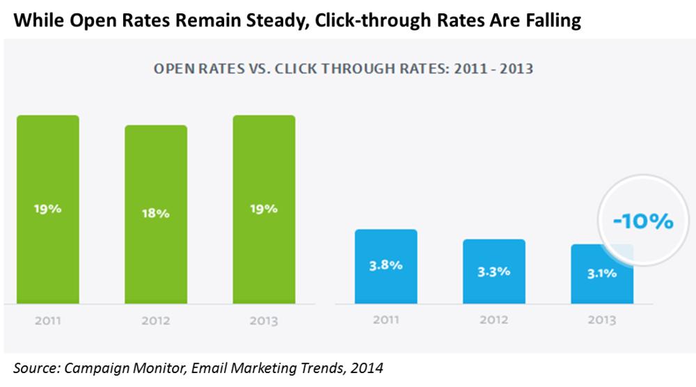
As email opens shift to mobile devices, there’s been a correlating decrease in click-throughs—a 10% decline from 2012 to 2013 alone, according to Campaign Monitor.

Unique Opens Vs. Total Opens

Of course, your reporting is duly tracking click-throughs. But if all you’re tracking is opens and CTRs, you may be missing something.

Here’s where it gets frustrating. Data that reports on email open activity is routinely accompanied with a few qualifiers that seek to explain why open data may be both under- and over-counting.

Email open tracking depends upon the downloading of an invisible 1×1 pixel gif image as embedded by the email provider.

As the Internet Advertising Bureau (IAB) warns, “some opens may not be detected when, for example, the user has images disabled, is on a mobile device, or has elected to receive text-only emails.” That would lead to under-counting.

And, as Campaign Monitor acknowledges in its study, “Apple devices display images by defaultthereby automatically registering an openwhereas many Android email clients don’t.” This could result in overrepresentation of Apple users in your data.

On the other hand, the IAB explains, “the metric may also falsely indicate some impressions when the message is briefly loaded into the preview pane but may not be actually viewed by the recipient.” Some email clients render HTML within the preview pane—every time the user scrolls through the Inbox and passes your message, it will count as an open.

Ugh!

The industry’s answer to this has been to focus email senders on Unique opens, a metric that eliminates the duplicates included in Total opens.

But the Campaign Monitor research raises a possibility that makes sense, especially for investment firms that are heavy users of emails to communicate with mobile-reliant financial intermediaries. It stands to reason that the multiple opens number includes some opens that indicate your content’s ability to prompt a second look.


A second look isn’t a click-through but it’s something. It’s more than an open and out. And, at a time when click-through rates are falling at a rate of 10% per year, multiple opens seem to be worth spending some time to better track and understand over time.

I would try to get my hands on your firm's Total Opens and Unique Opens data, including from media partners whose lists you use. Data that enables you to segment email response by device and email client would also be valuable to add to your reporting.

Your Best Prospects Are On A Non-Mobile Device

Mobile complicates an already complicated reporting dimension. Ready for more? Here are some additional findings included in the Campaign Monitor report based on its analysis of data for more than 1.8 billion opens from almost 6 million 2013 campaigns: 

  • The first battle is to win the mobile open: As has been well documented, an increasing percentage—41% according to Campaign Monitor—of email is being read on mobile devices. The most common time to click on an email is when it’s initially opened. 87% of clicks will happen then.

And yet, the fewest clicks happen the first time an email is opened on a mobile device. Only 78% of clicks on mobile devices happen on the first open.

  • Multiple opens more common than click-throughs: If users open an email on a mobile device, they are more likely to open it a second time than they are to click from their phone or tablet. Overall, 8% of people who opened an email on mobile clicked right away, while 23% opened it again later. (This would be a very broad benchmark to measure your own multiple opens/total open rate against.)
  • A second device optimizes the second chance: If a mobile reader opens an email again from a different device, more clicks happen. Mobile readers who open emails a second time from their computer are 65% more likely to click through. The Campaign Monitor Web page has a flowchart that visualizes this.

Your thoughts? 

RIAs, Content Scoring, YouTube Views: It’s A Random Reading Round-up

I never met a free ebook that I didn’t download. I’m inclined to take online surveys and accept flyers from people on the street, too. Hey, we’re all in marketing, we have to support one another.

Here’s my latest report on a random collection of ebooks, reports, a presentation deck and a whitepaper that I’ve read in the last few months, and recommend to you.

Rounding Up The RIAs

“The RIA Channel: A Roadmap for Driving Growth” is a 14-page whitepaper from Broadridge. It’s a data-packed overview of how mutual fund and exchange-traded fund (ETF) marketing has needed to dramatically change as RIAs have become an increasing focus.

“While the four main wirehouses offer central points of contact and provide a degree of product and process uniformity for their approximately 57,000 advisers, a number of RIAs just shy of that number are spread among 14,000 RIA firms,” is how the paper succinctly summarizes the challenge (while simultaneously making the argument for digital).

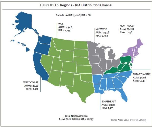
The paper includes insights on RIA segments and some suggestions for targeting the best prospects and product positioning. My favorite graphic maps where RIAs are in the country, shown below. Sourced by Access Data, a Broadridge company, it’s a nice content marketing turn, too.

A Broad Dive Into All Things Digital

Before you reflexively go to print Experian’s The 2014 Digital Marketer, you should know that it’s 138 pages long. Then again, it's a resource you may find yourself referring to all year. 

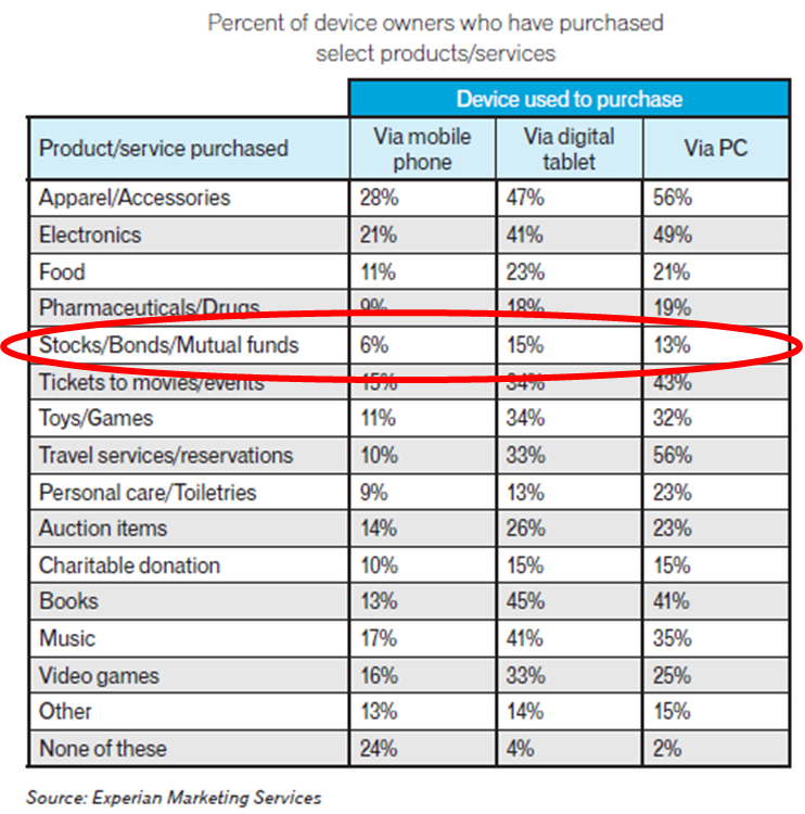
Published in March, this is Experian’s sixth annual report of benchmarks and trends. Financial services is mentioned as one of the leaders in Internet advertising, second only to retail, and there’s this table showing the percentage of people who transact stocks/bonds/mutual funds on mobile, tablets and desktops (more on tablets than on the PC?!).

But read this more as a lay of the land of all things email, mobile, social and search/display. Also, this year’s report devotes several pages to cross-channel marketing, as important to this space as it is to business-to-consumer businesses. 

Some Of These Are Not Like The Others

First there was lead scoring—online it involves interpreting a Website visitors' digital body language and behavior and understanding where they are in their information-gathering process. Because it’s marketers who are accountable for creating the online content offered at various points in the purchase funnel, it naturally follows that there should be some scoring of content, too.

This Kapost deck (the link opens a PDF)—and the video below—is slightly more commercial than the others in this round-up. Kapost sells content marketing software. Even so, it’s a good primer if you haven’t yet started distinguishing between the performance of your individual content assets. It’s a quick, heavily illustrated 40 pages. For the video, you’ll need to know that MQL stands for marketing qualified lead.

YouTube Views Before Subscribers

To no one’s surprise, OpenSlate’s Top 500 Brands on YouTube industry report does not include an investment company.

The most successful non-entertainment brands average 1.4 million average monthly video views and have an average of 82,000 subscribers. Investment firms don’t come close. In fact, the Business and Finance Industry, lumped together in a way that echoes YouTube’s maddening categorization, represents only about 20 of the top 500. And, they’re companies like SpaceX, Boeing, Geico, GE and Lockheed Martin. 

Here’s the graph from the report that’s worth your consideration: The relationship between views and subscribers. On average across all YouTube channels, every 200 views results in a new subscriber, OpenSlate reports. Brands generally need almost four times that—750 views—to convert a single subscriber. And, as you can see in the OpenSlate graph below, “business and finance” channels need close to 1,000. 

“There are many factors working against brands in this regard, including an inconsistent content and publishing strategy and the likely impression by a viewer that whatever drew them to the brand’s content in the first place will not be repeated. A high percentage of TrueView driven (paid) views by brands also has a large impact,” according to the report.

The Raw Power Of Tech-Driven Marketing

I don’t even know where to start to summarize this must-read perspective on how Marketing has changed. In the 40-page New Brand of Marketing ebook, Scott Brinker of ChiefMartec.com takes a leisurely approach as he recounts seven “meta-trends” that have led to nothing short of "cataclysmic" disruption in how marketers work:

  • From traditional to digital
  • From media silos to converged media
  • From outbound to inbound
  • From communications to experiences
  • From art and copy to code and data
  • From rigid plans to agile iterations
  • From agencies to in-house marketing

You’ll see much of the research and many of the datapoints that digital marketers like to quote and cite (e.g., on average 57% of the buyer’s journey happens online before prospects even talk to a salesperson), but Brinker provides the context and direction for them.

The narrative builds as a call to action for marketing to step up and “harness the raw power” of what's disrupted it. Brinker—whose work I’ve mentioned before—believes that marketing needs to assume responsibility for technology strategy and marketing. Specifically, he advocates for the role of a chief marketing technologist.

“If you’re responsible for the outcomes—how customers will perceive your brand in the digital world that is run by software—then you cannot afford to take a laissez-faire approach to the technological mechanisms by which those outcomes are achieved,” he writes.

Even if you’re familiar with Brinker’s chief marketing technologist argument, read this book for the extended reasoning supporting it. It’s all there.

Read anything good lately? Your recommendations are welcome below. 

Asset Manager Content Sharing Takes Off—Don’t Be Left Behind

There was a time not too long ago—seven months ago-ish—when the sharing of content published on mutual fund and exchange-traded fund (ETF) Websites was at low levels across the board.

That’s changing.

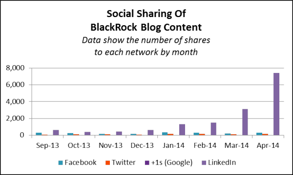
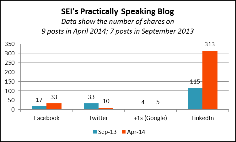
A comparison between the September 2013 sharing of content on the sites I blogged about in October with sharing in April 2014 shows that some fund companies are beginning to see significant sharing to social networks. Primarily to LinkedIn but not exclusively. The gains are stunning for BlackRock. Other firms are participating too, as you'll see below.

Why Isn’t Your Content Being Shared?

As for those of you whose content isn’t attracting the support you would hope for, it’s time to delve into why.

When nothing much is happening for your peers either, it’s easy to shrug your shoulders—i.e., uh, maybe nobody shares investment content. But now that others are starting to experience more of a social lift, what's keeping your content from participating? Let’s answer the question with a few questions: 

  • Are you making it possible to share? If you’re still publishing your commentary via Adobe Acrobat files, none of this applies to you. PDFs don’t get shared on social networks. Even if you and your content team are knocking yourselves out with the narrative and the graphics, you can’t be a contender and that’s unfortunate. This is particularly true of smaller firms—firms whose limited marketing resources could most benefit from a little help from others.

If at all possible with the Compliance direction at your firm and your Web publishing capability (or whatever it is that prompted you to default to PDFs in the first place), I’d find a way to add some HTML commentary to your site, along with social sharing icons.

  • How visible is your content? Waiting for others to find your content and pass it around is one way to go. The more effective way is to use your firm's own social accounts to call attention. 

Investment content sharing happens on four networks: LinkedIn, Twitter, Facebook and Google+. The data suggest that the most significant thing you can do to increase the visibility of the content you publish is to post it as a company update to LinkedIn. If you’re not doing that yet, I’d make it a priority.

A company presence on LinkedIn, hopefully buoyed by some support of your loyalist followers and even employees (where possible), should make a difference.

What we don’t know is the extent to which firms are paying for broader exposure through LinkedIn sponsored updates or advertising. That is the X factor. However, to my knowledge, there is no way to buy shares. Followers yes, but shares still need to be earned.

As shown on the graphs, LinkedIn casts the longest shadow here. There’s no site I looked at where tweets generated the most shares in April. But I want to put a word in for Twitter. Twitter is an effective means of calling attention to the availability and relevance of your content to the world at large, including topical news-hungry financial advisors, the media and other influential accounts. As impressive as the LinkedIn numbers are, don’t underestimate the power and reach of a few tweets. 

Facebook may be fading as a network where investment firm content gets shared to. In the set of data I looked at, Facebook shares were most important to Franklin Templeton's Beyond Bulls & Bears blog in the fall. That contribution seems to have dimmed since the start of the year (see below).

Google+ is a no-show in this data. With the singular exception of the Vanguard experience, little content produced by investment firms has been shared there over the last seven months. Now, after the surprise departure last week of Google+'s business leader and reported staff reorganizations, the prospects for the platform as a whole is in question.

  • Is your content visually appealing? A sea of gray text is going to get you and your content nowhere. You need images—lists, charts, even stock photos. And how about some subheads or pull-quotes to give your content a fighting chance?   
  • What’s the quality of your content? The availability, visibility and appeal of the look of the content is where most firms need to focus, I suspect. But in my analysis, I did come across a few firms that were posting to LinkedIn and not seeing much sharing. 

Creativity in this space and elsewhere has raised the content bar. You can’t expect to attract many eyeballs, let alone stimulate sharing by publishing one post after another all with the headline “Market Update.”

As difficult as this conversation may be with your content creators, you need to have it, to make the most of your collective effort. Take the data with you to the meeting. 

Some Sharing Successes

My analysis in October looked at the sharing of investment commentary-type content published, mostly on blogs, by 10 firms (AllianceBernstein, BlackRock, First Trust, Franklin Templeton, Guggenheim, MFS, OppenheimerFunds, PIMCO, Vanguard and WisdomTree). I used the SharedCount multi-URL dashboard to look at how many times a URL was shared on social networks. This data should be reliable as it’s based on direct queries to the networks.

Included were URLs to all posts published by the firms in September, a total of 111 posts. The mix included 22 updates from BlackRock on the high end and 4 from MFS on the low end.

Please see the post for the full report. To give you an idea, content published on all 10 domains resulted in 1,500 shares on LinkedIn. 

After recently noticing much more sharing on some sites, I decided to return to SharedCount for an update.

Sure enough, sharing is up across the board. 

If I were a digital marketer at a firm not benefitting from sharing, I might be tempted to discount the BlackRock results. There can be only one BlackRock and you may never be able to match BlackRock’s blog post production (21 posts in one month), helping drive 7,400-plus shares.  

But the pattern across multiple firms suggests that sharing of your content should be on the rise, too, regardless of the size of your brand’s footprint or even how often you publish. One of the blogs I looked at earlier was MFS’ On The Lookout, which published five posts in September. There were just two postings in April and yet one post produced 77 LinkedIn shares versus 5 total LinkedIn shares of all five September posts.

What's more, the sharing has been building. To confirm this, I analyzed the URLs of all BlackRock (the most prolific blog in this set, consistently producing 20-plus posts each month) and Guggenheim (the least prolific, producing a steady four Macro View posts a month) content published from September through April. Who's to say that April represents the top?

The additional graphs that follow are included not for the absolute numbers involved but to show the change.

What are your thoughts?

Compare Your KPIs To The Best In Financial Services

The “financial services” industry is a big ole bucket. 

But given the other industry possibilities (Retail? Media? Technology?), investment firms have more in common with banks, credit card, insurance and brokerage companies. If you’re a mutual fund or exchange-traded fund (ETF) marketer looking for data to measure your firm’s digital performance against, you could do worse than look at “financial services” benchmarks.

Smartphone, Tablet, Website Benchmarks

Specifically, Adobe this week published some benchmark data you might find useful. The Adobe Digital Index “Best Of The Best Benchmark” report is based on 210 billion visits in 2013 to 11,000 mostly large enterprise Websites that are customers of Adobe Analytics. The review set included “a few thousand financial services companies. We don’t break out our samples to any level beyond financial services,” according to Tamara Gaffney, principal analyst, Digital Index.

Adobe reported on the performance of financial services and four other industries (retail, travel and hospitality, high-tech, and media and entertainment) on five key performance indicators (KPIs): 

  • Share of smartphone visits
  • Share of tablet visits
  • “Stick rate” (the percentage of visits that include more than one page)
  • Pages per visit
  • Minutes per visit 

Conversion rate benchmarks are provided for some industries but not for financial services because, Adobe says, “financial organizations all have a different concept of a conversion." This makes it difficult to standardize for.

The data show that there’s a fairly large gap between the performance of the “best of the best”—the top quintile in each industry—and everybody else, aka “the masses.”

“The results of [the research] make it clear that organizations that invest in people, processes, and technology are reaping the benefits” is Adobe’s high-level conclusion.

Where Finserv Outperforms

The report provides an opportunity to see how financial services does relative to other industries and where the top 20% of financial services organizations are outperforming their peers.

You’ll want to download the full report for all the insights and data. Below are a few tables I created to isolate financial services. Just call me Parochial Pat. (No, please don’t.)

In the table above, you’ll see that the best financial services organizations lead other industries in stick rate. Almost eight out of 10 visits to the top quintile financial services sites included visits to more than one page. That’s impressive, according to Gaffney.

“Stick rate is very complicated because there are two factors that drive visitors deeper into a site. First, they must be the right visitor so visitor acquisition targeting needs to be optimized. That requires careful targeting as well as testing multiple approaches to discover which ones provide the best visitors.

“But then,” she says, “those visitors need to land on a page (sometimes from their phone or tablet) that works, is what they expected and has a clear next step. So content, responsive design, personalization and clear paths forward have to be in place.”

Bravo, take a bow!

Unfortunately, the best in this industry trail all other industries in percentage share of tablet visits, and all but high-tech’s best in percentage share of smartphone visits. 

But above see how finserv comes roaring back in the visits measures—the best financial services sites have the highest number of pages per visit, and trail only media and entertainment and high-tech sites in minutes per visit.

This data suggests that the best of financial services have some significant digital chops. Oh and here’s a look at the year-over-year improvement. Note the big gain in share of smartphone visits.

For your benchmarking, the table below may be the most useful. Above-average performance on these dimensions would be between the range set by the best in the industry and the average. 

Wide gaps between the best and the average suggest that the best are pulling away from the competition, which is Adobe’s point in publishing the research. Of course, you'd have a better sense of your relative performance if the research was provided for the asset management subsector.

Take a look at your analytics and see where you stand. Thoughts? Please comment below.  

Fun With Mutual Fund, ETF Website Traffic Data

The next time you have an hour or two—sooner if you just can’t resist—check out the mutual fund and exchange-traded fund (ETF) sites in the investing and financial management categories of SimilarWeb.com, which reports on Website traffic. There’s a free version, which will keep you more than occupied, and a few paid subscription levels.

The individual profiles help with competitive intel about traffic levels and traffic sources, including search and social (organic and paid). Taken in aggregate, they provide a fascinating perspective on how sites are networked on the Web. Also, it’s motivating, isn’t it, to think of all of these investors in search of information?

About The Data

Like Comscore and Nielsen, among others, the data that SimilarWeb reports is based on panels of participants. SimilarWeb claims to be “several times bigger than traditional panels. This allows us to learn about every Website, big and small, and overcome the statistical errors that are typical of smaller panels.”

However, SimilarWeb’s data is of desktop traffic exclusively, and therefore not comprehensive. Mobile visits are an increasingly significant chunk of asset manager site traffic.

If you use just the free access of SimilarWeb, take note that sub-domains of Websites are reported individually. Because many asset managers rely on multiple sub-domains or maintain separate domains, the rankings will under-report the effectiveness of a competitor online. And, it can be tricky to assess traffic out of context.

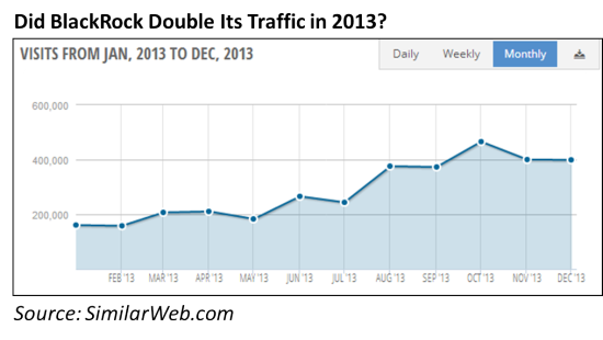
For example, BlackRock.com looks to have doubled its traffic in 2013. Is that the result of a very good year or is there another explanation—e.g., a consolidation of domains, for example?

The paid version of SimilarWeb allows for the selection of either All domains and Main domain. In the comparisons I cite below, I looked at All domains.

There seems to be a lot of movement in the top 100 rankings. I reviewed the data as of November 30 and as of December 31, and the composition of the list changed more than just a few positions.

Here’s a random list of what I found interesting about traffic to investing sites in general and to the industry’s most-trafficked sites. I’ve restricted myself to quoting only data that can be viewed for free on the site.

The More Things Change, The More They Stay The Same

First, how about some respect for the granddaddy and still number 1 among investing Websites: YahooFinance.com?

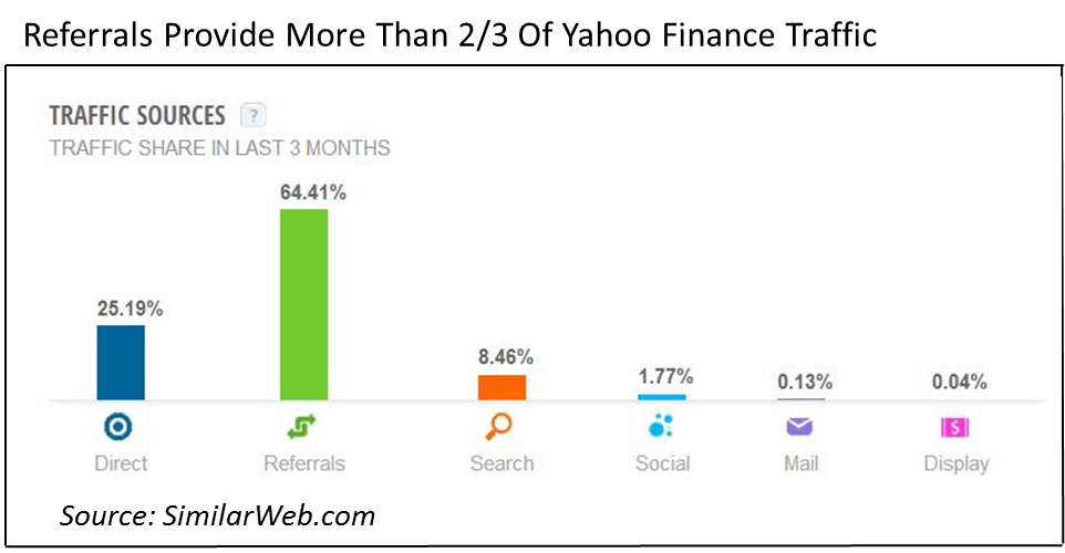
SimilarWeb says the site attracted almost 2 billion visits in 2013, 150 million in December alone. Yahoo Finance stays on top the old-school way—63% of its traffic comes from links from other sites, towering over search, social or even direct as a traffic source.

No asset management site whose data I reviewed comes anywhere close to that, and yet referrals can be an enduring source of traffic.

The New And The Odd

Quite a few new and new business-model sites have broken into SimilarWeb’s top 100 in the U.S. investing category. For example, Twitter skeptics, note that StockTwits ranked #15 in December. Two-year-old Wealthfront, “the largest and fastest-growing SEC-registered, software-based financial advisor,” breaks in at #94 on the list.

Does anyone else find it odd that of all the possible investing sites out there (including yours) FINRA.org comes in at #42? CFAs make CFAInstitute.org crazy popular (#63).

2013 Traffic Stable Or Climbing

The syndication of content and the popularity of social platforms together call the question: What's the future of corporate domains? When I last wrote about this topic in 2009, I cited asset management Website data that pointed to declining usage and traffic.

But the 2013 12-month view of traffic—visits and not visitors—available from SimilarWeb suggests that traffic to most sites has been stable, if not climbing.

Fidelity And Vanguard

Traffic to Vanguard.com ranks it as the first mutual fund/ETF site in the U.S. investing category—separated by about 2 million visits from TRowePrice.com, the next highest mutual fund/ETF site on the list.

Fidelity’s nearly 16 million visits trump all, but is categorized in SimilarWeb’s “financial management” category.

Winning Search Traffic

It appears that even the best trafficked sites could do much better at winning search traffic. This is lamentable given all the content available on asset management sites (and tons in the making). Most sites fail to significantly benefit from search results for search terms other than derivatives of their brand names.

Here’s an exception worth noting: In 2013 about 4% of Fidelity’s enormous traffic came from the search term: 401k. Impressive—and, of course, it helps that 401k.com redirects to a Fidelity domain.

Also, a few ETF providers are gaining hearty traffic from searches of their ticker symbols, albeit another form of branded search. Promoting their longer ticker symbols is something mutual funds have not tended to do.

A Few Social Surprises

Speaking from experience, one could lose oneself in the detail that SimilarWeb provides about social traffic.

The paid version reports the total number of socially sourced visits for the year and by that measure, Vanguard was the most effective social asset manager in 2013. But BlackRock came on strong in the fourth quarter. As can be seen reported on the free SimilarWeb, 12% of BlackRock’s estimated 400,000 monthly visits is 50,000 visits. From Social alone.

There are a few surprises in the composition of the social traffic. For BlackRock, YouTube was the major contributor. For Fidelity, it was Facebook.

But Vanguard’s top social driver was Reddit aka "the front page of the Internet." Reddit has been a strong source of traffic to more consumer-type sites (although reportedly less so in 2013 than in 2012). Vanguard, and Fidelity to a lesser extent, got a sizable amount of referrals from the platform in 2013. Reddit traffic drove visits to PIMCO, iShares, even American Funds last year.

What SimilarWeb can't tell us is the quality of the traffic or how successful the firms were in converting it.  

What about Twitter and LinkedIn? According to the SimilarWeb data, Twitter is driving more traffic than LinkedIn but both are just runner-ups.

Here’s a kick: Yahoo Bookmarks drove more traffic to the asset managers in the top 100 list than LinkedIn. It's a good reminder that investors and others are using all manner of new and old tools to keep track of what's happening on your site.

Have fun checking all this out.

Note: Yesterday RIABiz named this blog one of the top 10 blogs (#9) in the advisory community. It’s a thrill to be included in such a prominent set of commentators, and it makes me want to try harder to deserve the honor. I recommend the full list of blogs—which also includes the 10 bloggers’ recommended blogs—to you.