If Being Visual Isn’t In Your DNA, Change Your DNA
/ Tweet“Being visual just isn’t in our DNA,” one workshop participant pushed back by piping up. “We can do words—lots of words—but we don't do pictures,” she said as her colleagues nodded in solidarity.
OK, that’s a belief that has been too prevalent and if it’s afflicting your organization, you need to stomp it out. DNA can be changed (see this New York Times report, for example) and so can the way every mutual fund and exchange-traded fund (ETF) firm communicates. "To be visual" simply requires conviction and resources that include bigger fonts and brighter colors. You can do this.
This post revisits a favorite topic (see the July 12, 2012, “Asset Managers Start To Say It In Pictures”) but with added urgency. The most dramatic recent change to content posted to asset manager Websites—and especially to blogs, those insatiable beasts—has been in the visual appeal of the content.
To be sure, many firms are still extracting those sad scans of grayscale charts used in previously created (!) documents and passing them off as visual relief on all-gray Web pages.
But, more and more marketers are reading the memo—visuals help the brain process information, essentially facilitating communication.
The image above is an excerpt from a larger Optimal Targeting infographic called "The Future of Marketing." Yes, that's how important images are to marketing. Others’ visual communications competency is evolving and yours must too if you expect your customers and prospects to pay attention to what your firm has to say in 2015.
For one window into the very best graphics being published by asset managers, check out the social media accounts of your competitors or firms you have a particular interest in.
You’ll get an idea of both the content the firm is publishing and what’s getting shared. You may be surprised. If your content isn’t visual and inviting, it’s getting much, much less social support. The screenshot below shows the Photos & videos tab on the @JPMorganFunds Twitter account, as an example.
Here’s a quick review of some of what I’ve been noticing, in my visits to Websites and following social updates.
Keeping It Simple…
Simplicity is the key to this Nationwide Funds small caps vs. large caps graph shared on Twitter. There’s no proprietary data here, any fund manager could create this chart and many do. But the team behind this graph made a smart decision to downplay or even eliminate all but the necessary data points.
This stripped down version makes it possible for followers to get the main point from the visual as they encounter it in their tweet stream. The underlying Website contains all required information.
This Prudential Investments chart is another example of, when possible, less is more.
…And Quick
In fact, visuals don’t necessarily have to be made in-house. When time is of the essence, AdvisorShares (and other firms) regularly relies on screenshots of trading screens to make a point.
Dense With Data
Then again, some firms are taking the time to produce data-based interactives for their sites.
For example, here’s Putnam’s chart on the U.S. labor market recovery. Nothing about these—not the creation and maintenance of the graphic or the user’s consumption of it—is simple and quick.
Assuming your visual expounds on something of ongoing interest, a data-dense chart could be a consistent contributor for you. It could draw attention to your site and foster engagement.
And, given that the year is 2015, whatever you do has to look good on a smartphone, too. See how well the Putnam graphic works when shrunk to fit a phone in portrait mode.
Spare The Word, Save The Reader
If there ever was a firm with visual DNA, it would have to be Russell Investments, whose Economic Indicators Dashboard has been a thing of beauty for years. Note how few words are used in Russell’s newer Market Expectations graphic.
Spare The Word, Save The Reader, Part 2
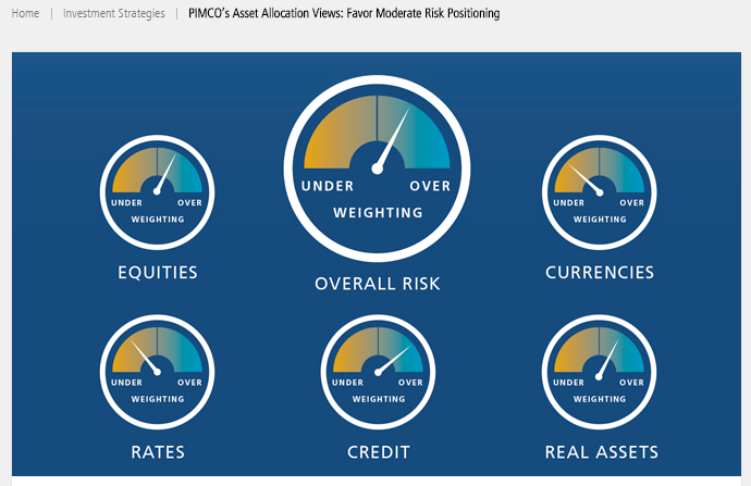
But even PIMCO, home of the long form narratives, is going visual. Having first appeared in a PDF at the beginning of the year, this updated Asset Allocation Views graphic now appears on the PIMCO blog.
As if inspired by Cliff's Notes, this Fidelity graphic provides five takeaways of a wordy business cycle update. The image appears on the update page on Fidelity's site and was used in a tweet. What about this couldn't you do?
Show A Little Love To Product
Finally, these charts from OppenheimerFunds offering “good reasons to avoid timing the senior loan market” serve as a reminder to extend your visual capability to product communications, too.
In this case, when the visual on the Website itself needs to be enlarged in order to be appreciated, it obviously won’t work as a social-worthy graphic. That’s when you need to create a separate image, probably a subset of the larger image, to share. It's an extra step that will be worth your time.


