Content Filtering: A Mutual Fund, ETF Website Differentiator
/ TweetA few years ago, Search Engine Land published a column with the headline “How Does Your Web Site Make You Feel?” The premise of the article by usability expert Kim Krause Berg was that decisions made by Website designers and developers affect us “emotionally, mentally, physically and spiritually.” (For more, see the post and see my 2009 comments on the subject.)
I was captivated by the idea. Haven't we all had the experience of landing on a Website and seeing something so creative, so appealing, so smart or so efficient that it elicited a reaction? Ahhhhh.
How can we produce Ahhhhhs on a mutual fund or exchange-traded fund (ETF) Website? Here’s one suggestion: content filtering.
Less Can Be More
Good for you that your firm has a lot to say, or that it offers a broad and deep product line (or multiple lines), and/or that you publish an extensive series of communications. Not so good for the Website visitor who has landed on your site with something they want to get done. He or she goes there for a reason.
You can elicit that feel-good response if you optimize users’ visits—including those from on mobile devices where searching and scrolling can be excruciating. Enable users to filter the wealth of what you offer. By improving their experience, you indirectly enhance their feelings about your site and yes, firm, too.
From my perspective, Search capabilities and content filtering are a key differentiator between asset manager sites. They can make the difference between a site that holds its own with some of the finest database-driven sites today like Amazon, LinkedIn, etc. and sites that betray themselves as having been built back in the days of browsing and not recently updated. (Shockingly, some sites have yet to offer an open text Search box. My advice is to make that a priority and then build from there.)
Respect The User's Effort
There is a line that governs usability work—“respect the user’s effort”—and that’s what underlies the filtering shown in some of the following examples.
We start with a few site-wide filter-capable Search examples that may represent the most ambitious undertakings.
Filtered site-wide Search may be out of the question in the world you that live in. Many firms publish to the Web from multiple closed systems that refuse to talk to one another, making integration of content impossible. Despair not, some firms are distinguishing themselves by offering the filtering of a specific content category (e.g., Literature and Forms or Insights and Research). Screenshots of a few of these follow.
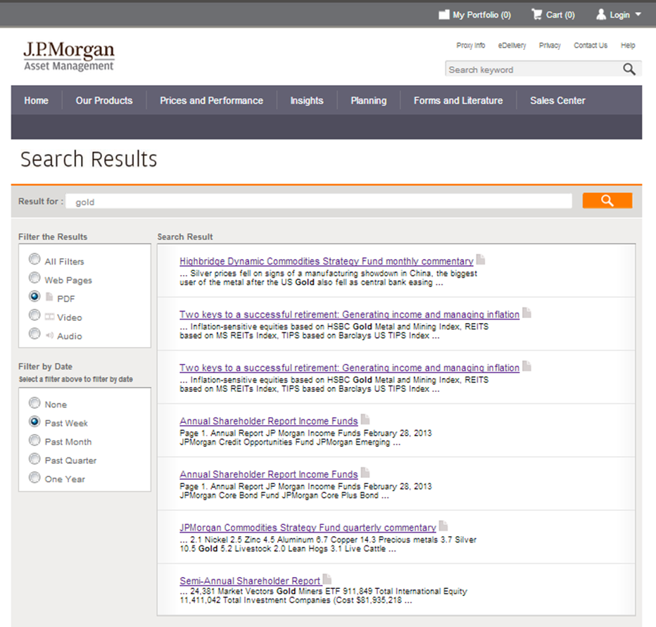
What And When: J.P. Morgan
What does J.P. Morgan have to say about gold? The Search results themselves aren’t that descriptive, but see how site visitors are enabled to narrow down the options, thanks to content type and date filters.
Expanded Categories: Invesco
While keyword, ticker and symbol searches are common on sites, Invesco Search goes further by expanding on the content categories. Fund numbers, portfolio manager names and "literature part number" filtered searches are not commonly offered.
Results Relevance: PIMCO
Despite its appearance on many firms’ Search pages, relevance as a sort isn’t intuitive. See how PIMCO offers Relevance and Date sorts as well as category, date and file type.
When 2 Filters Won’t Do: Henderson Funds
The Henderson Funds Literature page enables users to narrow options by three possible filters: document group, fund and keyword.
"I'll Have What Everybody Else Is Having"
It's an extra step to produce and keep these current, but the inclusion of thumbnails of literature covers in Search is a user-friendly move. Also helpful are the Most Recent and Most Requested sorts offered on Vanguard's Financial Advisor Literature page.
Assuring They Will Be Back: TIAA-CREF
The TIAA-CREF Asset Management Investment Data Center introduces Morningstar ratings and risk as added dimensions with which to filter. The listing can be shortened by creating a log-in to save favorites, and the My Briefcase function further organizes the user’s use of the listing.
What I love the most: The ability to turn on alerts to be notified when favorited documents are updated.
Making The Most Of The Visit: Russell Investments
See how Russell Investments respects the effort.
Multiple filters assure that visitors are not going to lose much time looking for an Insights & Research piece. Note the win/win in how Russell presents the default, featured content page—two options for subscriptions (RSS and email) make it convenient for the user while Russell makes the most of what might otherwise be a one-time only visit.
And, not shown in this screenshot, is the fact that an RSS feed can be created from the filtered Search. Ahhhhh...


