This post isn’t going to be for everyone. It’s a tad technical and requires you to get your hands dirty by popping the hood and at least exploring how your Web pages are made.
You may be tempted to bounce now.
On the other hand, as marketers, we’re known for sweating the details. The color of the firm logo has to be exactly right when printed on a four-color press. Some of us insist on using the full product name in all instances, even when those names do go on and on. Banners on booths have been ripped down because a comma was out of place.
If you care about all of the above, you may be willing to hang in here to consider some issues affecting how some investment management content appears on Flipboard, one of the most popular news reading apps available for iOS (iPad and iPhone) and Android smartphones and tablets.
Some Background
More than 100 million people use Flipboard, and it's regularly included among the top 10 apps recommended for financial advisors. If you’re not familiar with it, this Putnam wholesaler’s explanation will bring you up to speed.
Essentially, Flipboard provides the equivalent of a magazine reading experience by extracting content from user-specified sources, including blogs and social network accounts, and presenting them in an attractive layout. It's a personal magazine, I love it.
Here’s how Marcos Weskamp, Flipboard’s head of design, described its inspiration to Mashable in 2012: “If there is one element I've always admired from what [magazines] do, it's how every element placed in the page has a specific purpose. I just love how each story flows into the other one, how your eye can surf each page by jumping from headline to headline to photo, to pull quote and into an article. In the magazine world, each page is a small composition of a larger piece, and everything is in a way trying to pull you in to read the story. You can easily scan a magazine, and the moment something interests you, just dive in.”
Flipboard makes subscribed-to content more inviting to read. Theoretically, content that someone chooses to read through Flipboard should get a lift from the enhanced display, often including a related image, headline and a text excerpt. It’s a rich opportunity for content providers to draw more readers in.
The screenshot below is of a Flipboard page, illustrating how Flipboard can showcase content linked to in a tweet.

Due Diligence On Distributed Content
A few years ago we only dreamt that our content would grow wings and fly to distant places. Today broad distribution on platforms other than investment firms' own domains is effectively extending the reach of what you all have to say. And, kudos to you for originating and sharing content that attracts a following.
But with this extended distribution comes the need to be ever-diligent that others’ publication of your content is working as expected. Unfortunately, the Flipboard experience isn't ideal for all content. The presentation of some mutual fund and exchange-traded fund (ETF) content is disadvantaged in Flipboard, primarily because of what’s being extracted from the HTML and displayed.
This post isn’t meant to call anyone out. It’s impossible to describe what’s going on without showing a few examples of issues that are occurring regularly and keeping people from exploring the content. We all need to look out for one another.
Oh, and I should say, if there's an adjustment that needs to be made to the way your content is displaying, it's not going to be Flipboard that makes the change.
Some Specifics
I regularly use Flipboard to keep up with tweets from asset managers. You could do it, too—all that’s required is a one-time add of the Rock The Boat Marketing Investment Managers Twitter list or any select Twitter accounts or other social media accounts you’re interested in.
Obviously, my view is of 100% investment management content and may/may not be the way most advisors or investors see your content on Flipboard. They may view your tweets as part of an everything feed. That raises the level of competition for attention. Also, the page layouts are dynamic. An excerpt that takes up almost all of a page one time may be reduced in size the next time you open Flipboard.
However, the reading experience itself is always the same—the composition of each page to be flipped includes multiple entries of varying sizes and accompanying images, all pulled by Flipboard’s algorithm. More about the algorithm later.
The most appealing content is what gets attention within Flipboard and when you’re in the habit of flipping through, the typical user is unlikely to notice let alone dwell on anything sub-optimal. There’s too much interesting stuff "flowing" on any given page, the reader will move on.
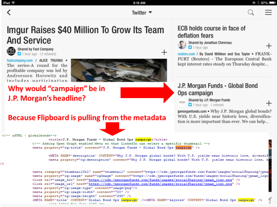
What prompted this post is something that I happened to notice about a J.P. Morgan Funds item in Flipboard.
 Campaign? Why would J.P. Morgan use campaign in a headline?
Clicking through the excerpt to the page on J.P. Morgan’s site confirmed that “campaign” wasn’t used in the headline. But a check of the HTML shows that “campaign” is in the metadata of this page and many other pages.
Noticing this about a month ago has made me hyperaware of how investment manager content is being displayed in the Flipboard app. Most of it looks great. Firms that are sharing images and graphics should be attracting lots of eyeballs, especially. But upon closer review, it's dismaying to see how widespread some issues are: Headings and text that firms don’t intend or expect to be published are often showing.
The problems seem limited to links to content on firms’ own Website pages and sometimes just sections of sites as opposed to links to posts on blogs. Links to other publishers’ content seem to be displaying just fine.
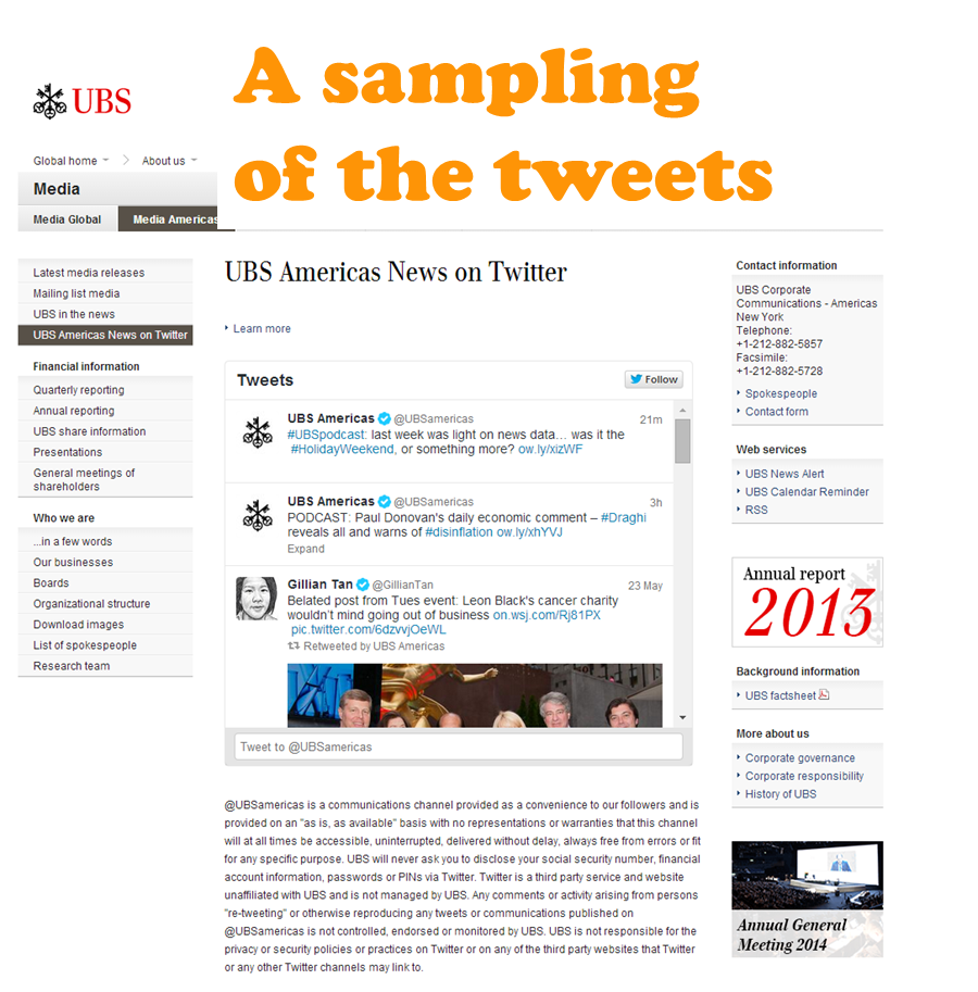
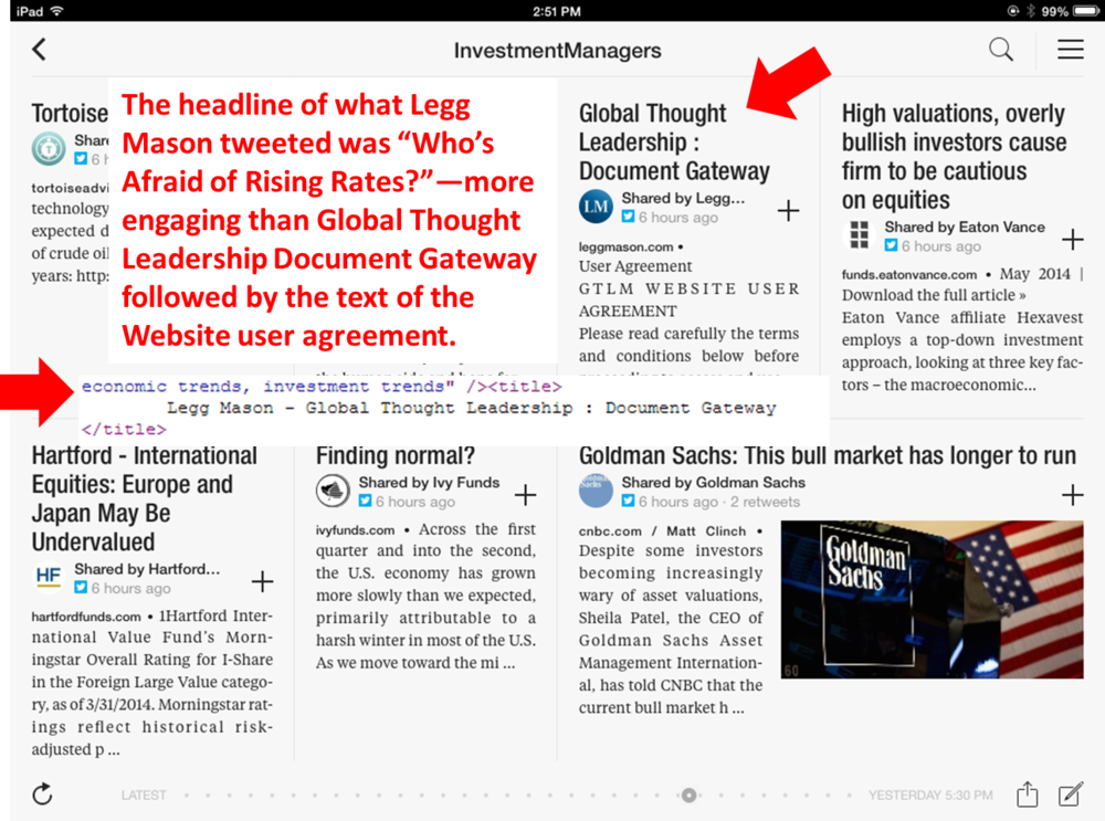
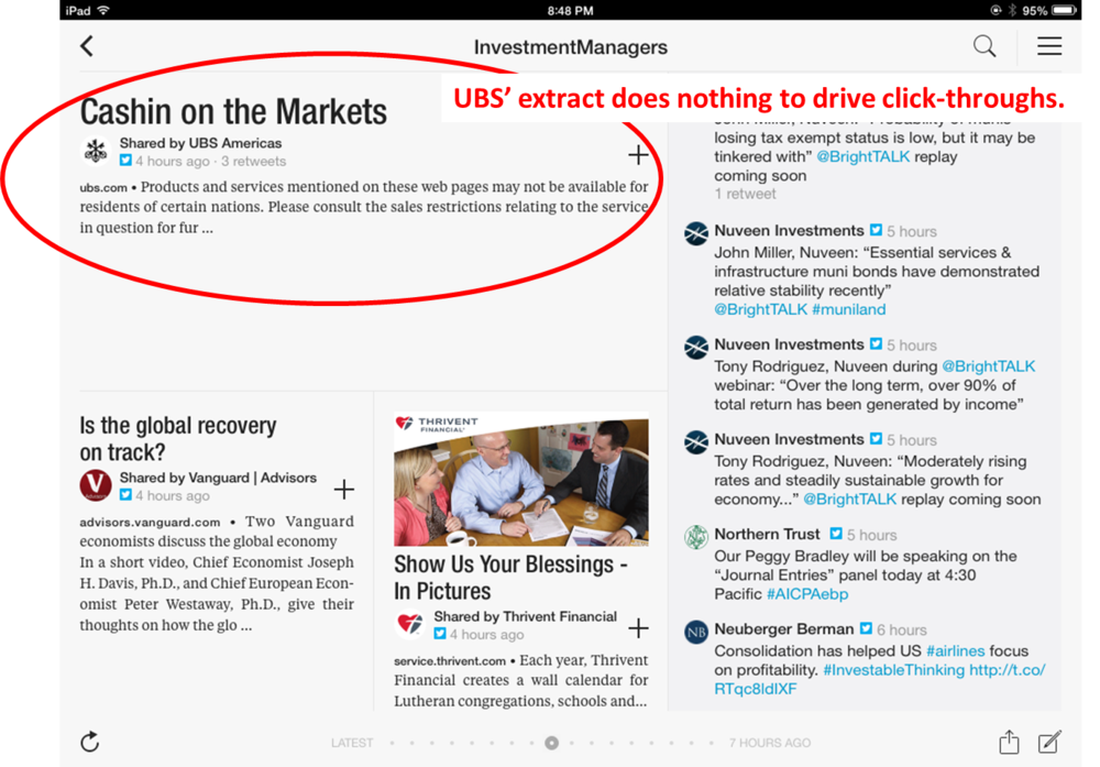
Sometimes—in the instances of the Legg Mason and UBS examples below—the extract is simply underleveraging the value of what’s being shared. The most common issue is that Flipboard is extracting a navigational heading referring to a type of content (e.g., Insights, Press Releases, Education and News Center) as opposed to the unique title of the work.
More people will be drawn to a headline like, “Who’s Afraid of Rising Rates?” than Global Thought Leadership Document Gateway. And note that the content extracted in the Legg Mason example is the Website user agreement.


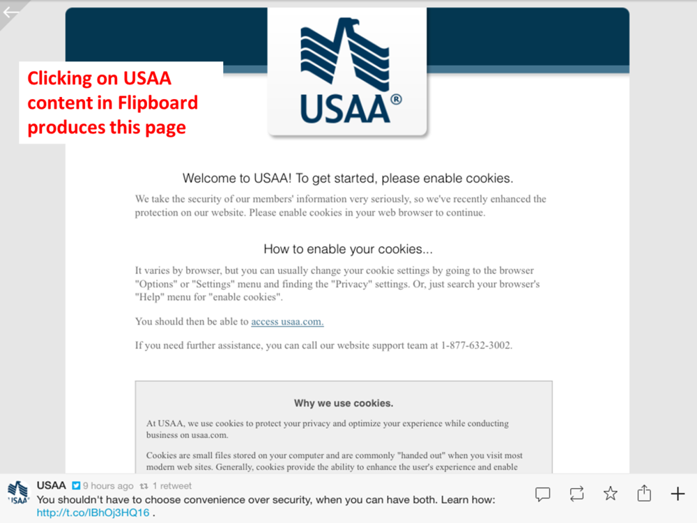
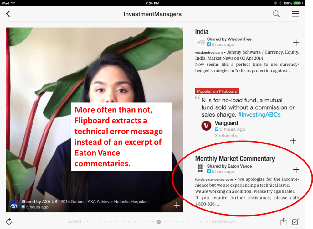
But certain USAA and Eaton Vance extracts show Website messages instead of content, and it’s apparent that something is not working as it should be. This is a lost opportunity, and then some.


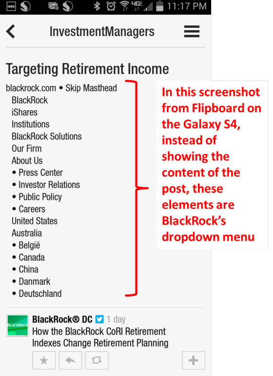
Most of the examples shown here are from the iPad app. The Flipboard smartphone apps use the same algorithm so the result is the same but mitigated by the fact that the content of the tweet is more prominent. Still, if you know that someone is taking the time to catch up with his or her news and you have a screen to yourself with which to engage the reader, it’s a shame to fritter the opportunity as is happening in this @BlackRockUSDC example below.
 Addressing The Issues
The issues involving the titles may be able to be easily addressed, probably depending on your content management system. (And just a general word of warning to be careful about the words included in your metadata. A few years ago, the FDA ruled that the same rules that govern pharmaceutical companies’ advertising, labeling and promotion also apply to metadata. I wouldn’t rule out this industry’s regulators coming to a similar conclusion.)
I’ve sent a few of these other examples to Flipboard, hoping they could provide some guidance, but after a month they haven’t had much to say.
Flipboard extracts are based on their algorithms, which they don’t share information about.
One commenter on Quora speculated, “The parsing and extraction can be done by looking for relevant HTML tags (e.g. <p>) which contain the more textual content than usual; they also analyze other aspects of the HTML such as relative position (main content tends to be more centrally located), tag affinity (article text tends not to be mixed with lots of other types of non-text tags). Some algorithms use more sophisticated techniques which require it to be trained on sample data.”
To view how Flipboard is extracting your social updates, look for your social account using the Search capability in the upper right-hand corner of the app.
If Flipboard is publishing “the wrong” content, you have three obvious choices:
- You and your IT support will need to troubleshoot and ideally address the page-specific issues.
- If you fail to identify a way to address these, you may want to take your limitations into consideration when selecting what to tweet or otherwise share.
- You could choose to not be bothered by how Flipboard is displaying the content.
Lots of attention right now is being paid to the Twitter profile changes, the deadline for which is May 28.
But remember that it’s a minority of Twitter users who read your tweets on your Twitter profile page. Much more likely is that they’re consuming the content you share in the app or news reader of their choice. As important as it is to make sure that the Twitter profile aligns with your brand, my recommendation is that you take care to also check out your content where and how your firm's followers are experiencing it.
 Note that direct, personal communicating via text is practically swapping places with communicating via U.S. postal mail.