The Latest And (Marketing) Greatest At The Morningstar Conference

So much of this business happens virtually—marketers, especially, spend little time in the physical presence of their financial advisor clients or their competitors.

MARIO GABELLI AT MORNINGSTAR CONFERENCE

MARIO GABELLI AT MORNINGSTAR CONFERENCE

To me, the novelty of everyone coming together under one big tent is at the core of the appeal of the Morningstar Investment Conference and what drives so much of the energy of the sessions and the Exhibit Hall. The conference is where industry participants come out from behind their desks and mingle, and where luminaries such as Mario Gabelli navigate the Exhibit Hall within easy reach of mere mortals.

The 2015 affair, held Wednesday through Friday last week, didn’t produce the OMG factor of Bill Gross in sunglasses, as happened last June and reverberated the rest of 2014. Regardless, Morningstar produced another successful and engaging event. I attended as a guest of Morningstar's Leslie Marshall, Director–Events, Magazine and Social Media, and my thanks to her and her team.

As I’ve done the last few years (see the 2014 and 2013 posts), I made a couple of random notes to mention to you. While others have reported on the substance of what was said at the event, the focus of these comments is on how content and marketing messages were shared. Pioneering work from previous years—whether in social, the mobile app, Exhibit Hall creativity—was improved upon in 2015. By and large, the change I spotted this year was incremental forward motion.

A Whole Lot Of Tweeting Going On

An event is about the exchange of ideas, and that’s something that happens from the presentation dais, in the Exhibit Hall and in one-on-one conversations. Social media amplifies it all. Let’s begin with Leslie’s report on the 4,600 #MICUS tweets and 31 million timeline deliveries by what I'd guess is the largest number of engaged Twitter accounts to date.

Asset managers continue to sharpen their use of the #MICUS hashtag. The following tweets showed that Wells Fargo and MFS were paying attention to the general sessions while simultaneously pursuing their goals to drive booth traffic. Well played.

Twitter is the back channel but this year for the first time, Morningstar displayed tweets on the big screen in between general sessions. Even more reason to give your conference tweets some oomph.

Now Including LinkedIn

The #MICUS focus centers on Twitter, which makes sense because that’s where most of the conversation takes place. But a few asset managers also brought Morningstar into their LinkedIn posts.

In addition to live tweeting from its @Vanguard_FA account, Vanguard created a LinkedIn update about what others tweeted from a product manager's Morningstar appearance.

One almost never sees this: A Calamos LinkedIn update quoted the comments of another asset manager, PIMCO, on active management while linking to a Calamos piece.

The App As A Content Repository

It’s official—the head nod is being replaced by a session attendee lifting up a smartphone to snap a picture of a slide. Is there a better compliment for a presenter?

But maybe this too will go by the wayside. Although not explicitly promoted this year, Morningstar is starting to use its browser-based app more as a go-to place for content—slides, whitepapers, links, etc., according to Leslie. She calls the app a "resource repository for attendees."

Attendees don't need to strain to take a photo of a slide if their event app contains a link to the entire presentation. And, tweeters can just take a screenshot of what's on their phones. More to the point for mutual fund and exchange-traded fund (ETF) marketers, this is another means of distributing your content.

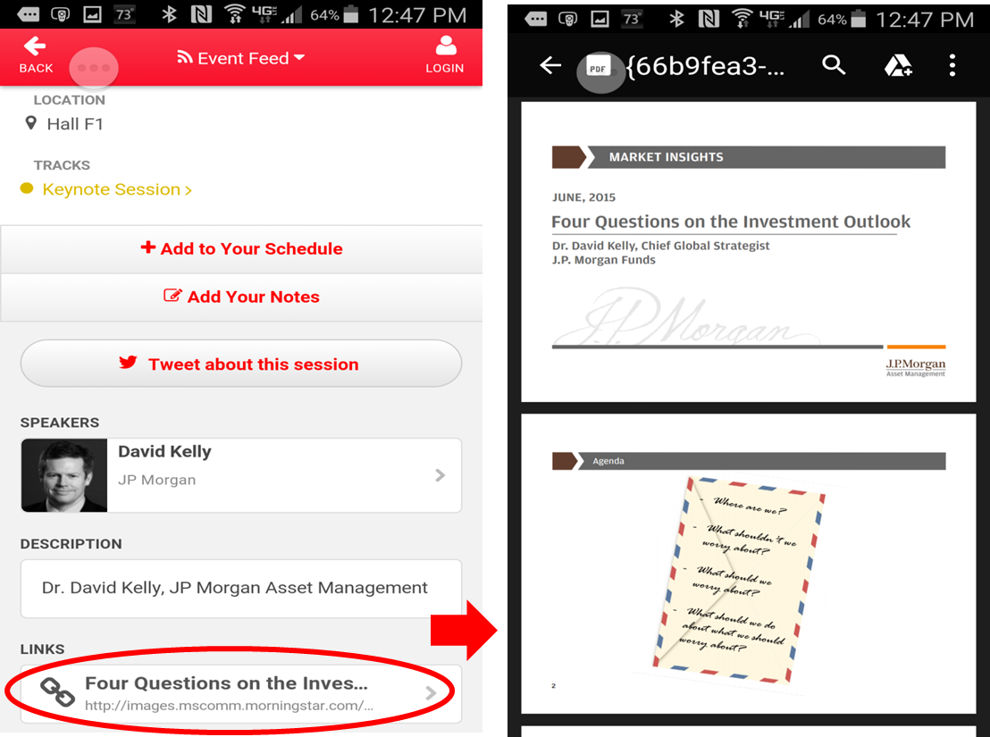
As you can see in the screenshot below, the Morningstar app event listing for the general session featuring J.P. Morgan’s David Kelly also included a link to the slides to the J.P. Morgan deck. 

JP Morgan Morningstar App

But this year a link to an asset manager document was uncommon. Typically, the event listings linked to a Morningstar deck associated with the breakout sessions (featuring representatives from multiple firms). A PIMCO general session listing linked to Morningstar’s June 2015 analysis of PIMCO.

The Social Media Center Comes Into Its Own

A few years ago, the Social Media Center was an oasis occupying an impressive amount of real estate in the otherwise bustling Exhibit Hall. I used to enjoy shooting the breeze with Blane Warrene and crew, only occasionally interrupted by financial advisor attendees. Most seemed to speed up as they passed.

But, props to Morningstar for sticking with it because last week the social media center was hopping. No more playing around with social media—it seems the surveys are getting it right, advisors are engaging.

Experimenting With Periscope

I looked forward to the conference as an opportunity to experiment with Periscope, an app released this year that enables a user to livestream or “broadcast” to Twitter.

Where better to use Periscope than to livestream what's happening at an event? That’s what I thought prior to the start of the conference and that’s what I continue to think, despite a fairly rough go of testing it myself.

My experience illustrates the hazards of working with new platforms. I was using Periscope for Android, which was released in late May. Things can go wrong or at least not as expected, and that can be discomforting in a professional setting when the value of the communication is that it’s live. Luckily, this was all for my own experimentation and no animals or clients were harmed.

My vision as I took to the Exhibit Hall first thing Thursday morning was to start Periscoping in the hopes that others would follow and interact with my account. (Because Periscope offers only a follower search, I even added #MICUS to my Twitter account profile just in case someone was searching for #MICUS Periscopes.)

Assuming all the correct settings are turned on, account followers are notified when a broadcast is live. They can interact with the broadcaster to comment, ask questions or send a little love in the form of a stream of hearts. This is so new, I wasn’t expecting a gang to pile in, but I was hoping there’d be some interest.

yes, it's a selfie stick

yes, it's a selfie stick

Prior to Thursday, I’d tested everything I could—streaming and talking and walking. Also, I came packing a sophisticated livestreaming camera aid that you may also recognize as a selfie stick (but aimed outward).

The value of Periscope is the livestream. But I wanted to save what I’d created so I’d tested the autosave to Camera Roll feature, too. The sound levels, available bandwidth and overall energy of the Exhibit Hall that morning all were things that couldn’t have been tested ahead of time.

As one of my first “scopes,” I created a 16-minute video during which I walked the hall, taking time to show each booth. In my wildest dreams, I was providing a service for the stay-at-home marketer who might want to check out his or her own firm’s booth or get a feel for the Hall layout in general—in real-time!

In fact, this happened—Natixis’ John Refford spotted me Periscoping, sent a request via the chat note within the app to see a livestream of the Natixis booth and the team. So, I created a special livestream just for him. It worked, sweet.

Periscope Broadcasts

I wish I could show you both of those videos but for some reason I can’t. The videos were saved, I can watch them as a replay within Periscope and on my phone. But despite repeated efforts to download them in a variety of ways, these videos won’t budge. There's barely an online user community to reach out to, and I’m still waiting to hear from Periscope’s support.

Two videos are able to be accessed, and their quality will likely reassure you that you’re not missing much not seeing the other two videos. There’s a lot of pixelation, the audio and video are out of sync at times, the lighting and the volume are not great.

If all I wanted was to create a video to show later, my camera on my phone would have done a much better job. Periscope offers the promise of both showing a stream live (and I had higher quality expectations) and saving that stream to use later.

Having hopefully managed your expectations, the following are two livestreams (since saved and lightly edited as videos) that I created. My hope was that they might draw a live question or two from Twitter at large but none materialized. Even so, I'd underestimated the distraction of watching the phone for viewers to join or chat while filming an interview at the same time.

MainStay's Virtual Greeter

The first video shows MainStay’s virtual greeter, which was easily the most innovative booth traffic-driver (my tweet referred to it as booth bait) at the conference this year. MainStay is 2 for 2 for producing the Exhibit Hall's top head-turner, following an equally innovative campaign last year.

MainStay’s Director of Social Media Frank Ranu explains how the lifelike motion-sensitive greeter uses a few opening lines to draw attendees in to watch brief video clips.  

T. Rowe Price iPad App

T. Rowe Price was one of a few firms that seem to have devoted their booth space to their apps (J.P. Morgan Funds being another). I wandered into the booth and found myself talking to Darrell M. Riley, Asset Allocation Group. We’d planned on doing a demo, but the demonstration iPad happened to be low on battery at that very moment (the heartbreak of live). Darrell smoothly segued into an explanation of the MarketScene app strategy.

Later, I just had to chuckle about what I put these two gentlemen through. The Exhibit Hall was dotted with professional lighting and video setups, and it was their luck to be visited by a woman waving a dinky phone on a stick, asking them to talk to it. Oh and to remember, “Everything is going out live to Twitter!” They were sports.

I encourage you and your teams to research Periscope—and vertical video in general—yourselves. There are lots of possible applications for a livestream and it could be awesome. As with all other platforms you don’t control, just remember to limit your dependency/exposure and have a Plan B communication method ready.

Were you at the conference this year? Please use the space below to tell me what I missed.

New Insight Into Advisor Marketing: Those Mobile Apps Make A Difference

Cogent Reports released some fascinating data this week about the effectiveness of various digital, traditional and media marketing tactics. Of course, what’s not to love about the headline of the press release: “Digital Outreach Delivers Impressive Results for Asset Managers.”

Websites and Webinars scored well, but the big surprise was the finding:
“On average, more than three-quarters (76%) of advisors exposed to asset managers’ proprietary mobile apps indicated they are likely to increase business with the firm, compared with only 34% of advisors who were not exposed (a 42-percentage-point lift).”

This is for Q1 data posted to the Cogent Reports Advisor Touchpoints™ portal, which tracks the performance of the marketing efforts of the 15 leading mutual fund, exchange-traded fund (ETF) and variable annuity (VA) providers.

Not to be crass but...ka-ching! Driving more business is what marketing is all about.

Of the nine Cogent touchpoints, the average lift ranges from a low of 15 percentage points for News recall to the high of 42 percentage points for mobile apps and Websites.

I encourage you to read the press release and a related blog post with an image that names the Cogent-tracked firms that are leaders in the various tactics. It’s a three-way tie between J.P. Morgan Funds, Franklin Templeton and Vanguard in the apps category, and the American Funds Website still rocks, according to this data. 

Awesome intel and thanks to Cogent for giving us a peek at the proprietary research. 

Compared To B2B, B2C

It's exciting to think that something so new (the first apps were launched in 2008, and asset manager apps followed) could be having such an impact for app providers.

Unfortunately, a relative few asset managers have committed to what's required to launch and continue to maintain/enhance an app (see a related April 2013 post and October 2013 post). Prior to this data, some have struggled to make a case for the investment required. Providers' business success with apps has been a bit of a sleeper.

Every business needs a Website and email and print materials (I guess). But a mobile app? That's been assumed to be optional in this industry—even though by 2013, 92% of the top global brands had apps in Apple's App Store and 75% in Google's Play Store, and small businesses, including many financial advisors', have followed with their own apps.

Also, a milestone was crossed last year when comScore reported that 52% of the time consumers spent online occurred within apps, leaving 40% of the time spent on desktop browsers and 8% on smartphone and tablet browsers. 

Mobile apps may be even more important when marketing to advisors than in other forms of business-to-business (B2B) or business-to-consumer (B2C) marketing. The graphs below are a rough comparison of what Cogent reports is effective in advisor marketing versus B2B and B2C marketing, as reported on by Webmarketing 123 in a February 2015 report, 4th annual State of Digital Marketing report.

There is a difference to keep in mind when considering these: Cogent data tracks financial advisor response to the digital, print and media marketing of 15 tracked firms while the Webmarketing 123 data is based on a survey of marketers’ view of content marketing effectiveness, including return on investment. 

Based on what’s shown below, what works across the three types of marketing is generally in sync. The big divergence, however, is in the importance of a mobile app to advisor marketing. It’s not like the rest of B2B marketing. In fact, the importance of the delivery form (although likely to be much heavier in content and product data) is more on the order of B2C marketing.

First here’s a simple ranking of Cogent’s touchpoints using the Cogent measure in the first image above: lift in asset manager brand consideration after exposure, in percentage points.

The graphs below show some of the same tactics, as reported on by Webmarketing 123.

B2B Digital Marketing Effectiveness
B2C Digital Marketing Effectiveness

A few additional notes:

  • "Website" is not a discrete category in the Webmarketing 123 survey. Instead, it reports on more granular work than Cogent—videos, case studies, blogs, infographics and ebooks—all of which presumably have a presence on the B2B or B2C marketer’s Website. If I could pick one category for Cogent to add to its touchpoint work, I’d ask for two: videos and blogs.
  • Note that SEO (search engine optimization) and paid search are two categories broken out in the Webmarketing 123 survey and appropriately so since both are deemed to produce more revenue (16% and 12%, respectively) than social media or display. The Cogent work does not report on these, which are less common tactics at asset managers across the board although practiced by the leading firms tracked. Metrics on these would also be great to see.
  • At what point does B2C, B2B and advisor marketing, too, address the effectiveness of advertising especially relative to the spend?

Just 5 Sites Command Almost Half Of All Finance Keyword Search Rankings

May I just say how much I love a free online tool?

The latest object of my affections is Ayima Pulse, which is a visualization of Google search rankings on more than 50,000 non-branded keywords. It offers “share of voice” leaderboards on the top Websites in 10 verticals, including Finance. (Insurance gets its own leaderboard, which is a refreshing departure from tools that track finance and insurance under one big ole financial services bucket.)

You’ll want to go and check it out yourself, but here’s what I’ve gleaned after spending some time on the site.

Search Ranking Volatility

Ayima provides a look at daily ranking changes over the last 30 days. According to the latest data, Finance search rankings are not volatile.

This has particular relevance now. We are just past the April 21 start of the rollout of "mobilegeddon," when Google said it would change its search algorithms to remove non-mobile-friendly sites from searches conducted on mobile devices. The expectation was that rankings would be significantly re-sorted as some sites would drop, the result of a Google penalty.

However, the Ayima data suggests that it was a non-event for Finance search leaders, judging both from the flatness of the volatility graphs and from a comparison of the leaders on desktop and mobile search. This looks to be the case, incidentally, for all the verticals except Gambling.

Finance Search Ranking Volatility.png

Search Leaders

What Ayima calls "Visibility (share of voice)" is calculated from the search volume, ranking and estimated clickthrough rate (CTR) of all sector keywords, converted into an overall percentage. Arrows indicate site movement within the leaderboard from the previous day.

Finance Search Ranking Leaders.png

To the right are the top 10 Websites ranking for Finance keywords. I've been watching this daily updated ranking for several days, by the way, and CNN and Yahoo frequently trade places between #1 and #2.

No investment product providers have broken into the top 10. Just two investment company brands—Fidelity at #34 and Schwab at #61—are on the larger list of 100 sites that Ayima makes available. Each site has less than 1% of share of voice. Related: Morningstar.com ranks #31.

Below is a look at how Fidelity and Schwab search visibility on mobile devices has fluctuated over the last 30 days. Fidelity has been more up and down, but both are labeled as mobile-friendly by Google and neither appears to have suffered from the algorithm change.

Schwab Fidelity Search Rankings.png

Search Concentration

The top five Finance Websites command 48%, or almost half, of the top finance keyword search rankings. That leaves every other finance site to slug it out for the other top keywords.

This is second only to the Jobs vertical—the top five Jobs sites snag 64% of their keyword rankings. There’s the least concentration in Education, where the top five leaders in that vertical attract have just 19% of all organic search rankings.  

Finance Desktop Search Ranking Concentration.png
Finance Mobile Search Ranking Concentration.png

Fear Of Missing Out?

So, what's to be made of the fact that mutual fund and exchange-traded fund (ETF) firms are nowhere to be found on the list of the top 100?

Buck up there, SEO-aware and socially-savvy asset management marketer, it's not a certainty that your sites are missing out. This is not necessarily a reflection of investment companies’ search performance because there are at least two pieces of information we don’t have:

  • We don’t know what the top 50,000+ Finance keywords are (an email I sent to Ayima has yet to be answered). In its April 20 introduction to Pulse, Ayima explained that “at midnight each day, we take Google’s top 100 organic search results for the most popular non-branded keywords relevant to our top 10 industries and add them to our database.” For a general idea of the top 1,000-ish Finance keywords, of course, you can always consult the Google AdWords Keyword Planner.
  • We don’t know what individual firms are seeking to rank for. Your keywords are probably long-tail. But...in an array of 50,000 keywords, there are likely to be words you want.

If you’re feeling competitive, I wouldn’t look at the top of the list where it can be no surprise that the media sites dominate. I’d look toward the bottom of the list. What do Visa’s PracticalMoneySkills.com (#94) and the American Finance Association Journal of Finance site (#62) do that you don’t? Should OurFreakingBudget.com (#83) outrank your site? Hmm, who knew that Pinterest.com (#27) was ranking for finance keywords?

On the topic of being anti-competitive, let’s take a moment to consider Google.com’s #3 ranking. Finance keyword searchers use Google, only to be taken by Google search engine rankings to a Google property (Google Finance or even just an inline result—see this post) almost 10% of the time? Interesting. 

If you spend your days thinking about how to effectively use Search to draw people to your business online, the visibility and volatility data provided by Ayima is all pretty interesting. It's another valuable tool to add to the digital marketing toolbox.

A First Look At Fund Website Benchmarking Data

Digital marketing success isn’t defined in terms of Website traffic. There’s so much else to consider.

However, benchmarking data on the overall level and composition of your site traffic vis-à-vis your competition can be useful. You’re appealing to the same broad audiences, and their behavior on related sites should have some meaning for you.

This is a follow-up to last October’s post about the return of benchmarking to Google Analytics. Now there's data to analyze! Here's a first look at it.

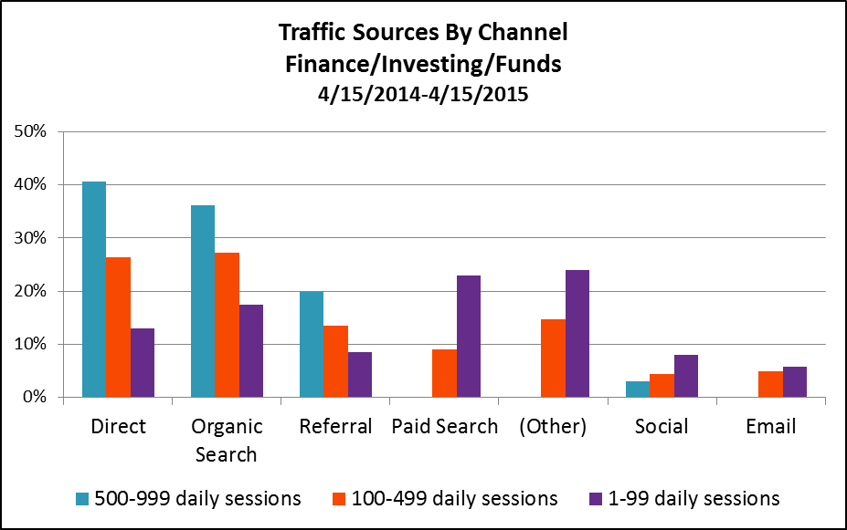
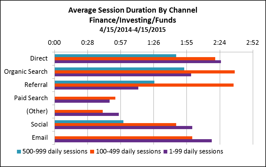
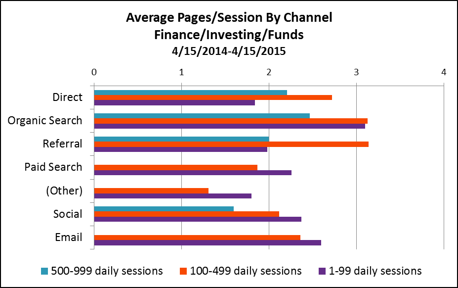
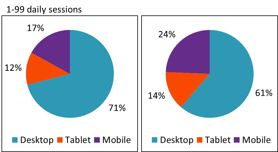
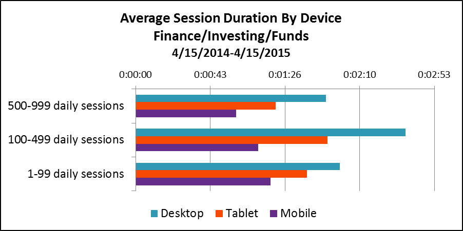
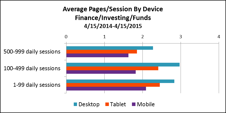
The graphs below reflect 12 months of activity (April 15, 2014-April 15, 2015) on 426 fund Websites whose firms have opted in to share anonymized data to enable benchmarking.

The sites are grouped by number of daily sessions, and the data in the graphs are based on three groups: 0-99 daily sessions (sample=377), 100-499 daily sessions (sample=29) and 500-999 daily sessions (sample=20). Google doesn't yet have a large enough sample to report on fund sites with 1,000 daily sessions and more.

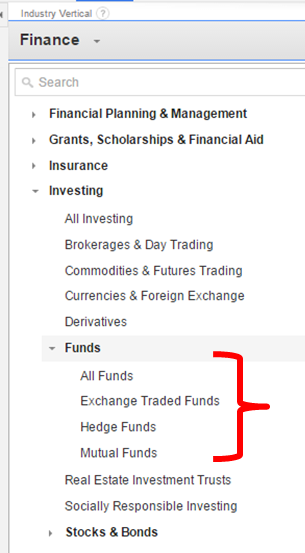
All data can be found in your Google Analytics account. Just go to Audience/Benchmarking. I looked at data at the Funds level (including mutual funds, exchange-traded funds [ETFs] and hedge funds), exported in Excel spreadsheets to be able to work with it.

This is more real (not based on user panels but on actual data that Google is collecting on sites) and more granular (most free benchmarking services stop at Finance or Investing in general, which includes brokerage sites).

Still, the benchmarking will be even more useful:

  • When mutual fund and ETF site benchmarking data is able to be reported separately. That can’t happen until a sufficient number of properties agree to contribute data. If your firm hasn't yet opted in, you might want to consider. More on that in my previous post.
  • When some category inconsistencies are addressed. Google has no trouble recognizing direct, search (organic and paid), referral and even social traffic. But if site publishers aren’t using tracking code to distinguish between display and email traffic, Google may mis-categorize it as direct traffic data. You’ll see below that Google benchmarking data is being reported for paid search, other paid traffic sources and email for the less trafficked sites but not for the most trafficked sites.
  • When you isolate your own peer group and delve in. I’m presenting the three groups together to get a high level sense of fund company Website traffic in 2015. Compare your site's traffic to your peer group and you’ll learn more.

A Few Takeaways

1. Overall, it looks as if the most that a fund site can hope for are a couple of minutes of the visitors’ time and a couple of pages viewed. This data suggests—let me amend that—makes the argument for easy-to-find content on sites that anticipate the task-oriented visitor. They come, they get, they go. Not that there's anything wrong with that.

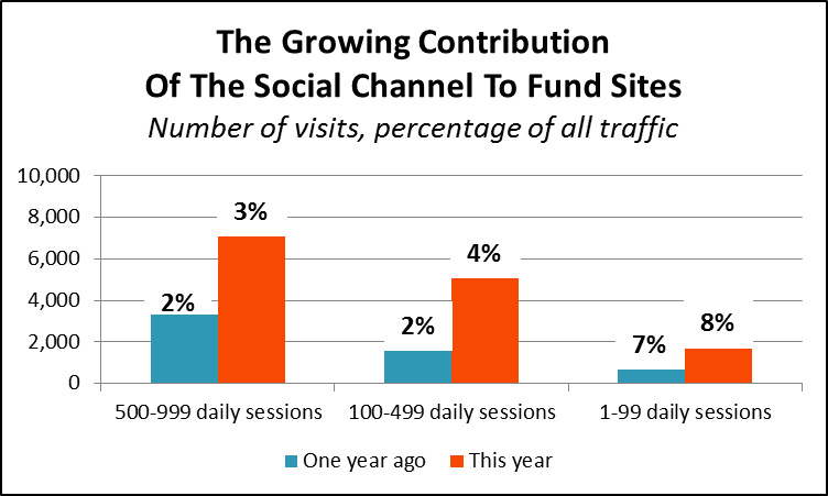
2. Finally, we have data on the contribution being made by social efforts and by email—two areas that there is great interest and investment in.

In fact, see the growth in the total number of sessions driven by social in the most recent 12-month period over the previous period. Benchmarking data is available only from August 28, 2013, so the earlier period comparison is from 8/28/2013-4/14/2014, eight months versus 12.

3. Direct traffic (a reflection of brand awareness and product familiarity), organic search (a measure of content availability, quality and accessibility) and referral links drive the better trafficked Websites. Less trafficked sites rely on paid search, other advertising and organic search.

4. There’s a difference in the traffic sourced by each channel: Direct traffic, organic search and referrals lead to more longer-duration sessions, with more pages viewed.


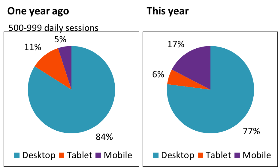
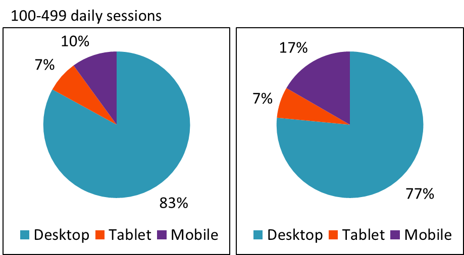
5. Just about one out of four visitors to fund sites comes from non-desktop devices (e.g., tablets or smartphones). This is a remarkable change that has undeniable implications for sites created for desktop use.  

6. Desktop sessions last longer than mobile sessions, which is to be expected. But, there isn’t a big difference in the number of pages viewed across devices. Here too, it’s few pages across the board.

Drilling into your firm’s analytics will help you understand whether this is a good or bad thing. It’s good if you can see that visitors are immediately finding what they need and then moving on. Not so good if the short visits point to visitors—even more frustrated because they're on smaller screens and possibly on the go—who give up.


An Over-The-Shoulder Look At Advisor Sites

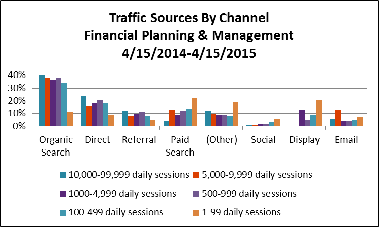
Out of curiosity, I also looked at the benchmarking data of sites that are in the Financial Planning & Management category, which together represent about 6,800 Web properties. Nine out of 10 of these attract fewer than 100 daily sessions. Google reports data on sites attracting as many as 10,000-99,999 sessions.

Make no mistake about it—many financial advisors are turning to the same content marketing and paid search tactics that asset manager sites use to build awareness and drive interest. I spotted certified financial planner Jeff Rose ranking for "Roth IRA" searches back in 2010, and more advisors have gotten more serious about inbound marketing since. (In fact, see FMG Suite’s 2015 Inbound Marketing award winners—there are some impressive marketers on that list of financial advisors.)

Few advisory firms may enjoy the brand recognition of your firms or the marketing budgets. The benchmarking data gives us an idea of the organic search strength among financial planning sites.

And there's more—but I'll leave the rest for you to explore.

Will Notifications Help Re-Engage Your Mobile Web Users?

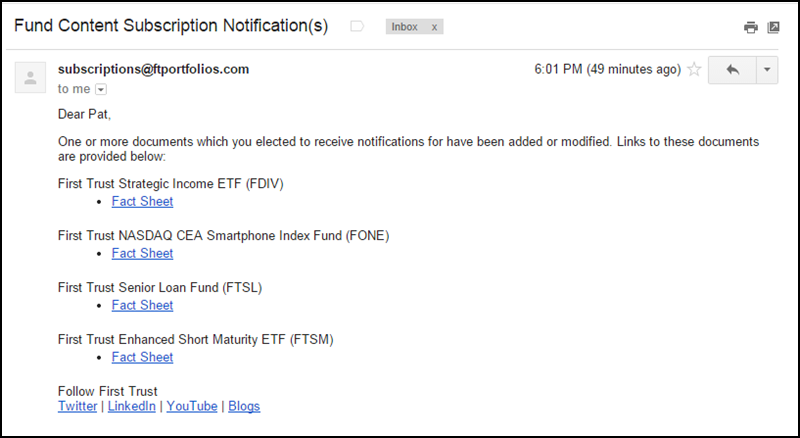
By now, asset management marketing has demonstrated its ability to create campaigns capable of driving traffic to Websites. Subscription to the firm’s updates, whether via email, social or RSS, has been less consistently successful. And that’s a shame: time-sensitive messages, fresh Web content and new functionality in many instances languish, waiting to be discovered.

Wouldn’t you love to be more proactive about reminding people to make a return visit? Wouldn’t it be awesome to be able to reach out and park a notification right then and there on an advisor’s browser or smartphone home screen?

Easy, tiger. The good news is that now you can. Web push notifications enable visitors to a site to opt in for notifications from the site. Once a user has opted in, he or she can leave the site, and notifications will be sent, even when the browser is closed.


The bad news? There really isn’t any, except to acknowledge that these are early days and Web notifications on a large scale are untested. But it's not too early for you to include notifications on your firm’s digital roadmap. (I wrote a blog post to the same effect three years ago, which may really have been too early. In retrospect, I'm happy that practically no one read it.)

The difference-maker is that, as of this month, the Chrome browser now enables notifications. That's important because Chrome browser users make up about 53% of desktop traffic.

Web browser notifications have been available for a few years on Safari, the Mac browser used by 5% of desktop traffic (see the CNN example below), and they’re heading to Firefox, too.

Implementation Questions

The technology has been delivered in the latest version of Chrome (version 42, beta), and Google has named Beyond the Rack, eBay, Facebook, FanSided, Pinterest, Product Hunt and VICE News as sites where you can expect to see Web notifications in coming weeks.

Still, there are lots of questions that remain to be answered about the implementation. See the issues raised by these posts alone: Push Notifications Come To Chrome and Android and Push notifications via Chrome are great, but complicate things a bit.

If developers haven't quite figured everything out yet, it may come as no surprise that a marketers' guide to Chrome notification best practices has yet to emerge.

To see how Web notifications work, here’s a video explanation courtesy of Roost. Roost is a notification service provider (in business since 2013) whose Website has some of the most best informational resources that I’ve found.   

Roost Web Push - How it Works from Roost on Vimeo.

Toward An Equally Meaningful Relationship

User familiarity with notifications has been building for a while now, thanks to Facebook, LinkedIn and Google+ notifications, among others, on the Web. Mobile app notifications have become obnoxious to me, I'll admit. Frequently, the last step in the app download process is a request to send notifications—that’s something I habitually swat away.

But there’s a case to be made for paying attention to the notification “channel.”

At one point, it was believed that the Web would lose both traffic and engagement to mobile apps, as was articulated in a 2010 Wired article, “The Web Is Dead. Long Live The Internet.” In fact, last year comScore reported that mobile users spend the majority of their total digital media time in apps, not on the Web.

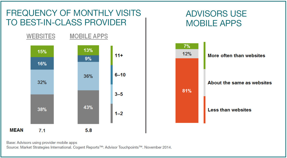
Closest to home, Market Strategies International in December 2014 predicted that financial advisor mobile app use was "set to explode." Almost one in five advisors uses mobile apps more than Websites, according to that research.


Chrome's support for notifications is Google’s attempt to bring the mobile Web to parity with the capabilities of apps.

These are the opening paragraphs of its blog post Monday:

“With low friction access to content, the mobile web provides a great discovery experience for users and unparalleled reach for developers. Unfortunately, once users discover an experience they love, it is hard for them to build a deep meaningful relationship since websites lack the rich engaging capabilities of native apps such as push notifications and home screen icons.

"To take advantage of these engaging mobile capabilities, some developers build native apps, but users are often reluctant to spend the time and effort required to download and install them, despite the benefits. As a result, developers have needed to decide between the engagement potential of a native app and the reach potential of the mobile web.” 

A TechCrunch post published this week goes further, arguing that notifications are the next platform and will be “the starting point (or 'front door') for all of the interactions on your phone.

I found this especially interesting and remembered the now legendary quote: “If the news is important, it will find me.” This was attributed to a college student in a focus group in 2008, and it's been cited in presentations and other works ever since.  

Expecting an asset manager Website to pull people to it is increasingly unrealistic, I’m starting to believe, given today's reliance on mobile devices. Push needs to work harder.

The mobile world that “started out as a pull-driven model—discovery and access was/is largely driven by a combination of the app store and the ‘grid of apps’” is evolving toward "engagement defined by push-driven notifications that eliminate the need to even go into the app,” wrote TechCrunch contributor Anish Acharya.

It's not much of a leap to wonder whether we're heading toward a time when notifications eliminate the need to go to a Website or—perish the thought—open an email. Notifications could be that important.

Early Thoughts

Here are a few notes I’ve had, thinking about the implications for mutual fund and exchange-traded fund (ETF) firm planning.

  • The notification capability available in asset manager mobile apps has been underleveraged to date; few apps ask to send notifications and those that do barely use it. My guess is that there’s no strategy in place.
  • Those who opt in to your notifications—loyalists likely—will be demonstrating a level of trust that you’d hate to abuse.

It will not fly to just port existing notifications over to this new mode. Consideration of notifications will need to involve a holistic review of what’s worthy. What’s understood as notifications that are delivered today via email are not what you’d barge in on a browsing session to deliver.

The opportunity deserves its own review and could tap information and data not even being communicated today. Enabling technology, governance, content, frequency, timing, etc. all are conversations to be had.

And, Web notifications aren’t the only reason to make this investment in time and brainpower—eventually you’re going to need to get attention on wearables.   

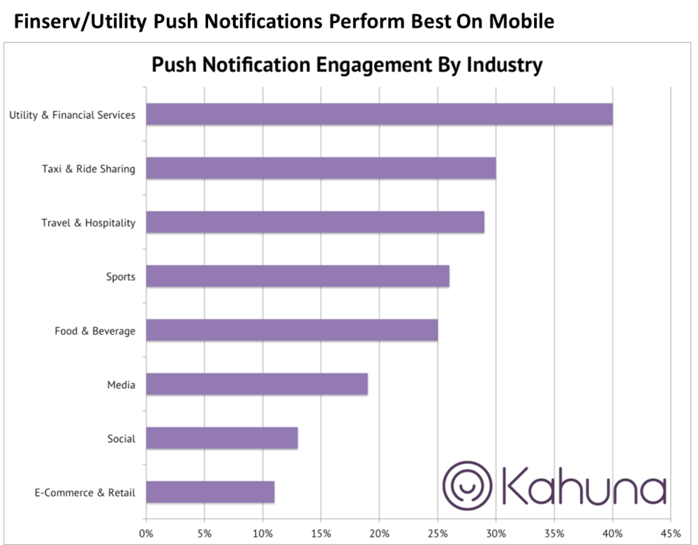
  • What’s encouraging is that people appear to be open to financial services notifications on mobile devices. Financial services iOS mobile notifications have one of the highest opt-in rates (55%) and financial services/utilities notifications on mobile devices enjoy the top engagement rates, according to consumer data reported by Kahuna.

  • The most effective notifications will be distinguished by their relevance, with logged-in users receiving the most segmented, even personalized notifications. This can’t happen overnight, as many firms are experiencing this year, last year and next with their marketing automation initiatives aimed at financial advisors.

There’s very little information available online yet to describe exactly how Web notification personalization works. I was signed into Chrome with my Google account, which explains why I received a Roost notification on my Chrome-enabled Android. But can a notification-sending Website tap into the signed-on data that Google has? Can the response find its way into a CRM to marry up with customer data?

Watch this Roost video to get a sense of the analytics and CRM integrations you might want.

Finally, here's a related but much less complicated Chrome enhancement: The beta Chrome For Android also now supports “Add To Homescreen” icons for sites that are mobile-optimized. Code can now be added to Websites to display Add to Homescreen banners to encourage visitors to add shortcuts to their phones’ homescreens. This, too, should help re-engagement.