A Quick Update On Multiple-Device Users, Cross-Domain Tracking, Tag Management

Measurability is a key difference between digital and traditional marketing.

The possibilities for gaining insights from digital analytics are boundless and ever-expanding—that’s the good and the bad news. There’s a lot to keep up with.

For a quick tune-up this week, I sat in on a Digital Marketing Depot Webinar, “Digital Analytics Checkup: How to evaluate the impact of your web analytics data.” The title was promising but it was the inclusion of Jim Sterne, founder of the Digital Analytics Association and eMetrics Summit, as a co-presenter that most appealed. I’ve heard Sterne speak before and it's always worthwhile. The co-presenter was Jenny Elliott, senior manager of digital analytics for CrossView, a cross-channel commerce solutions provider.

If you’re lucky enough to be a dedicated Web analyst employed by a mutual fund or exchange-traded fund (ETF) firm, you may be on top of all of this. But if analytics are only part of what you do or if the analytics function reports to you, I recommend that you invest an hour and listen to the full presentation on-demand.

My takeaways follow.

What The 'Insights Consumer' Needs

Sterne set the scene with some comments on the art of analysis. “It’s about asking really good questions. If your job is cranking out reports, you’re doing it wrong,” he said.

“The insights consumer," according to Sterne, "wants an answer to one of these three questions: How do we make more? How do we spend less? How do we increase customer satisfaction?”

He offered this advice for analysts communicating with business managers: “Don’t come to me with data, come to me with stories. If you come to me with numbers, you make me responsible for the numbers and I’m going to ask you questions about how did you get these numbers. But if you come to me with an impression based on the numbers, I can trust you to know the numbers.”

The business manager doesn’t want a report, he or she wants an opinion, Sterne said. “Your informed opinion based on the data is your contribution. That’s why we hire analysts.”

De-duping Visitors

While enabling the collection of more and more data, technology is resulting in a fragmented view of the visitor, Elliott noted.

Specifically, she discussed three issues: 

  • Multiple-device users can confuse things. 

Elliott quoted a Cisco forecast that a single business user will be accessing the Internet via an average of five connected devices (e.g., desktop, smartphone, smart watches, smart TVs, Google glasses) by 2018.

Analyses that focus on session growth alone fail to take into account the effect of visitors visiting from multiple devices. And, Elliott touched upon a few analytics solutions including device mapping, universal visitor cookies and device metrics stored in CRMs, all of which enable an analyst to link views to a single viewer.

Unique visitor metrics will be more important than the session-based metrics that we have come to rely on, according to Elliott.

  • Cross-domain tracking—relevant for even the smallest asset management firms that have a site and blog on separate domains or maintain multiple microsites—is another issue that analysts are gradually returning to. The technology supporting early attempts to track traffic across domains was, as Elliott says, “scary” and complex.

Some analytics tool providers have made significant investments in the last year to enable users to de-dupe visitors. While solutions that include multi-site roll-ups and tracking methods to pass cookies across domains are not yet “a walk in the park,” the technology is not as daunting as it was just two years ago, Elliott said.

“Think about the power you can give your marketing organization if you can give them insights into visitor behavior on not just one domain but on all domains,” she said. “They’d have so much more context to figure out how to market, how to provide good personalized content, all because they have a much more cohesive view.”

  • Finally, Elliott discussed tag management tools, which manage the variety of analytics, ad-serving, affiliate relationship tags that are typically added on an ad hoc basis to Websites. 

Tag management solutions are more simple to use and can shift the responsibility from IT resources to Marketing, which should improve responsiveness. If you’ve ever waited for IT to add code that you needed on the site yesterday, you understand the value of being able to control tags.

Several efficiencies can be gained from tag management. A universal tag will reduce a site’s page load time, especially critical to mobile device users (see Will Google Deem Your Mutual Fund, ETF Website Fast Enough For Mobile Users?). Since all data is formatted in the same way, it will result in clean data that can be analyzed on a more timely basis. Once implemented, tag management can help provide a complete picture of visitors across an ecosystem. This, Elliott noted, can enable powerful segmentation opportunities. 

(For an introduction to Google’s approach to tag management, here’s a video from 2012.)

On another matter: At the Morningstar Investment Conference in June, I was interviewed by Stephanie Sammons for her new Wired Advisor podcast series. Steph made the 20-minute podcast available last week. You might want to check out the entire line-up out to hear the thoughts of a few people—including financial advisor/thought leaders Michael Kitces and Roger Wohler—prominent in the investment space and whom I’ve mentioned on this blog.

The Gladys Kravitz Guide To Snooping On Your Neighbors

Gladys Kravitz, the Bewitched character who felt it was her duty to keep tabs on her neighbors—I’m hoping you’re familiar with this 1960s sitcom via Nick At Nite or maybe the half-hearted movie—was simply ahead of her time. Today, she might be Director of Competitive Intelligence and Strategic Benchmarking Insights for an asset management firm.

Something was going on over there, Gladys was right, and she was relying on only her keen powers of observation.

If you are equally as passionate about your neighbors/competitors online, today you have many more tools at your disposal. I’ve written previously about SharedCount, SimilarWeb, App Annie and SpyFu, among others. Here’s a quick look at four more that you can use to snoop with.

How Do They Do That?

If you’re wondering how a competitor is working its own brand magic, just use BuiltWith.com to check under the lid.

Information on the enabling technologies running a Website can be valuable to technology solutions salespeople (BuildWith’s target audience) and the pricing packages reflect the value and power available, including SalesForce and LinkedIn integrations.

My needs (e.g., which firms are using WordPress as their blogging platforms?) are simple, and yours may be too. For us, the Chrome extension provides more than enough intelligence on the content management, Web analytics and marketing automation solutions powering mutual fund and exchange-traded (ETF) fund sites.

For example, here’s an excerpt of the American Funds technology profile, showing the analytics and tracking technologies employed.

Banner Bonanza

Are you in need of inspiration for an upcoming digital campaign? Well, you could make a nuisance of yourself on the trade media sites, reloading and reloading hoping to catch different creative. Or you could head on over to Moat.com, where you can search by advertiser and find multiple ad units. Clicking on one of the ads will reveal some information about where it last ran.

Media planners would do much more with this site, and brand analytics are what Moat sells. Here again, I'm appreciating what Moat gives away.  

The screenshot below shows the detail provided on one of 765 Vanguard ads Moat has logged.


Watch This

YouTube success requires standing out from the crowd, because the crowd is adding 100 hours of video each minute of every day.

If you’re not familiar with optimizing for YouTube or if you’re unhappy with your results, VidIQ Vision is a terrific tool that enables you to learn from how others do it. Just add this Chrome extension to your browser and you’ll see detailed publishing information about every video you review on YouTube.

While you could limit your research to just mutual fund and ETF firms, why not learn from what the top brands on YouTube are doing? The screenshot below shows the optimization supporting a GoPro video published a week ago, which now has almost 2 million views. Note that strong social support and a large follower base helped drive views, too.

What’s Working?

As I blogged about last week, content marketers need to focus on what’s working and produce more of that while producing less of what isn’t working. Simple.

Your analytics on your content are central to that analysis, of course. But—since your competitors are also writing for the same audiences—there’s something to be learned from the content that’s taking off on others’ sites.

Use Buzzsumo for this.

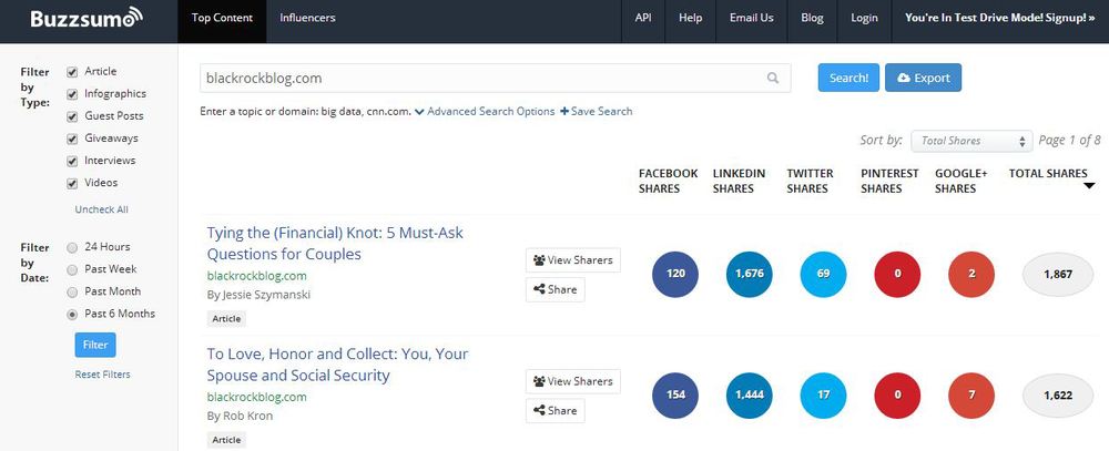
Let’s look at the BlackRock blog, which is not just the most prolific but probably the most socially shared. Check out the Total Shares column at the far right. Quality, frequency and social appeal can be a powerful combination.

You could spend hours on this site. Note the advanced filtering and exporting capability. It produces results for Web pages as well as for blog posts. Buzzsumo sells solutions for influencer analysis but you can see a lot with a trial account.

Now let’s go out there and make Gladys proud.

Beach Reading For The Mutual Fund, ETF Marketer

Who cares if the pages get a little soggy? 

Life is good for the mutual fund or exchange-traded fund (ETF) digital marketer who finally gets some time on the beach this summer (or on a gently rocking boat) to catch up on the latest ebooks. For your reading pleasure, here’s a guide to the best of what I’ve been downloading lately.

Go Mobile Or Stand Still

While the take-no-prisoners tone of We Are Social’s Social Brands: The Future of Marketing amuses throughout, this ebook is especially strong and relevant on the subject of mobile. 

It elaborates on five suggestions for “better mobile marketing:” 

  1. Deliver value: utility, entertainment, or social interaction.
  2. Harness mobile context: tailor experiences to the different situations in which people engage.
  3. Streamline the experience: adapt content for a range of different devices and connection speeds.
  4. Make it portable: enable people to continue their experience across devices, especially when sharing things.
  5. Offer varying depths of immersion: e.g., for people with a 30-second work break or with a 30-minute commute. 

Yes, there's a lot more to be done for mobile users by brands, including by asset management firms.

Heavily illustrated, these 127 pages are a fast, provocative read.

Hey Now, No Need To Choke Any Throats

The Marketer: “The site is too slow.”

The IT Guy: “It’s not that the site is slow...but we do have a performance issue.”

Grrr.

If you as a marketer are stumped about what to say next when the conversation heads in this direction, then Limelight Networks’ 103-page “Optimizing The Digital Experience” is for you.

The ebook itself says it’s written for IT staff and leaders, of whom expectations have evolved as more of business has become digital. While IT’s previous job may have consisted of building, managing and integrating content and Web tools, IT is increasingly expected to focus on user experience, this paper says.

“Because digital is becoming such an important part of the business, IT managers are required to think about the end user experience like never before. So when it breaks, you fix it," according to the ebook.

"But is being a firefighter putting focus on performance? Is fixing things when they break a strategy?”

Spoiler alert: No, the break/fix model is not a strategy for managing a technology ecosystem with both external-facing (e.g., Websites) and internal-facing (CRM) digital elements.

While some of the ebook will be of greater value to your IT partners, a chunk of it is a must-read for the digital marketer who realizes he or she needs to be more conversant. You will get a lot out of the first three chapters, which describe the elements of digital performance and the importance of establishing key performance indicators (KPIs). Check out the list of performance testing tools on page 47.

Bored At Work? You Won't Be For Long

KMPG’s Investing in the Future is a sweeping forecast of how the whole of the asset management industry will transform by 2030.

You can see the implications for marketers in just this statement alone: “The industry will have to capture new customers far earlier and keep them longer, by offering products tailored to a younger, less affluent and potentially less financially literate market.”

Oh and then there’s this line, too: “The industry will need to radically change its value proposition to remain relevant in 2030.”

Demographics, technology, environmental consciousness and social values, behavior and ethics all will conspire to shake things up in the coming years, according to KMPG. It takes 80 pages to make its case, and concludes with the top 10 questions for firms to consider.

A beverage with an umbrella might help the medicine go down.

Sales & Marketing 2014

Unlike some of the other ebooks, revenue + associates’ Modern Sales and Marketing Best Practices isn’t going to dazzle you with its layout and graphics. It takes an editorial approach to presenting 10 conversations with leaders including people you likely recognize: HubSpot’s Mike Volpe, MarketingProfs’ Ann Handley and ion interactive’s Scott Brinker.

It’s all relevant and useful, thanks to good questions from Louis Gudema, revenue + associates’ president.

This ebook is freshest on the subject of Sales, specifically social selling, in the interviews with Zorian Rotenberg, Jill Rowley and Nigel Edelshain. They get into some interesting detail.

How To Succeed On LinkedIn

The LinkedIn ebook factory has produced quite a few documents this year. Here are two that you don’t want to miss.

1. The 2014 Professional Content Consumption Report, which LinkedIn bills as “a deep dive into the top content-consuming members on LinkedIn and how marketers can connect with them.” Production of this piece comes at a time when LinkedIn is pedal to the metal on building out its content publishing platform. 

One factoid to bear in mind as you’re preparing your LinkedIn company page updates: The content needs to be mobile-friendly. In Q1 2014, an average of 43% of unique visiting LinkedIn members came through mobile.

2. Way back in March, LinkedIn presented the idea of a content marketing score as a means of providing companies insight into the impact of content shared or otherwise interacted with on LinkedIn. A ranking of trending content also was introduced, and the content marketing score + trending content became the inspiration for The Dynamic Duo ebook.

As is strangely worded in the video above at 0:11, LinkedIn recognizes that “there may be questions about your content marketing. Questions surrounding your content marketing and how to make it most effective could be causing shadows over your strategy...”

The two enhancements should help brand marketers tune their efforts—or, as the video says, "eradicate uncertainty."

I’d be more enthusiastic if these analytics were made available to every company that took the time to contribute content that enriches LinkedIn’s platform. Unfortunately, both resources are available for customers with a LinkedIn account representative (advertisers with at least $25,000 to spend per quarter, in other words).

Have you downloaded any ebooks you recommend? Before you head to the beach or boat, please suggest them below.

There's More To A Social Media Landing Page Than Disclosure

Firms whose every public communication needs to be evaluated in terms of its compliance with regulations can sometimes inadvertently mistake who the customer is. The customer isn’t the regulator. There’s more to do, more to be communicated once the regulations have been satisfied.

A case in point: What’s being linked to from many investment firms’ social profiles.

Let's review: 

  • Establishing a presence on social networks is no cakewalk for mutual fund and exchange-traded fund (ETF) marketers. It’s a cross-functional tightrope, and the operating guidelines can take months to pull together. Even after all that, Legal and Compliance may have reservations, and there can be the veiled threat that it could all be undone at any time.

To prevail and move forward, marketers pledge to be on their very best behavior. There's no appetite for revisiting what's already been approved, and working well enough. 

  • And yet, there's an opportunity to consider: The establishment of an account on a social network gives that account the potential for visibility that far exceeds any other unpaid opportunity on an Internet presence with highly engaged traffic. 

Specifically, the ability to link from the home state of the social account—the bio of the Twitter profile or the About pages on Facebook or YouTube (where more space is available)—provides a near priceless chance to move people interested in what you say on a social platform to your own domain. 

The opportunity here is different from online advertising in at least three ways: It has no expiration date, your potential reach is limitless and yet no minimum number of impressions is assured, and there's no charge. 

As with advertising, the page you link to needs to be well considered. The best practice for online ads is to direct traffic to a landing page customized to anticipate just that traffic.

However, many firms don't offer a link to a social-audience landing page to visitors to their social profile pages. There are plenty of instances where social profiles link to landing pages that are no more than the firm’s home page—you know, those kitchen sinks dressed up as extravaganzas in sight, animation and hyperlinks. Where's a newcomer supposed to go?

Worse, some bios link to a fund company’s prospectus page or Legal disclosure or documents. And that sound you hear is the sound of someone back-back-backing up and out. Too serious too soon.

While links to those pages may satisfy Compliance, they fall short of what your bio-clickers might be looking for. They need additional attention if you have any expectations to convert that traffic.

A Few Deviations On The Landing Page Theme

What are your options, while still meeting all of Compliance's requirements? A spot-check of the pages that FINRA-regulated firms link to from their Twitter, Facebook and YouTube pages show more variety than you might expect. While none of these pages is visually arresting in the way that advertising landing pages strive to be, you’ll see an effort to 1)communicate more than what’s required 2)be visitor-centric and even 3)seek to convert. 

Excerpts are shown below, which means that you may not see the required disclosures in the screenshot. Follow the links or click on the images to see the full pages.

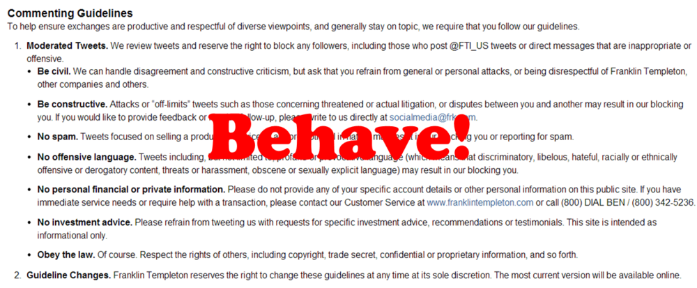
BlackRock and Franklin Templeton (shown below) use their pages to pass on some participation guidelines.

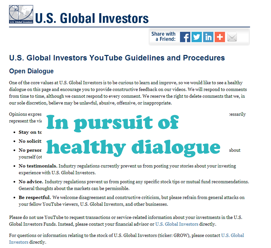
As one of the few firms that allows commenting, U.S. Global Investors explains its YouTube guidelines. This is the rare investment firm landing page that's unique to just one social network.

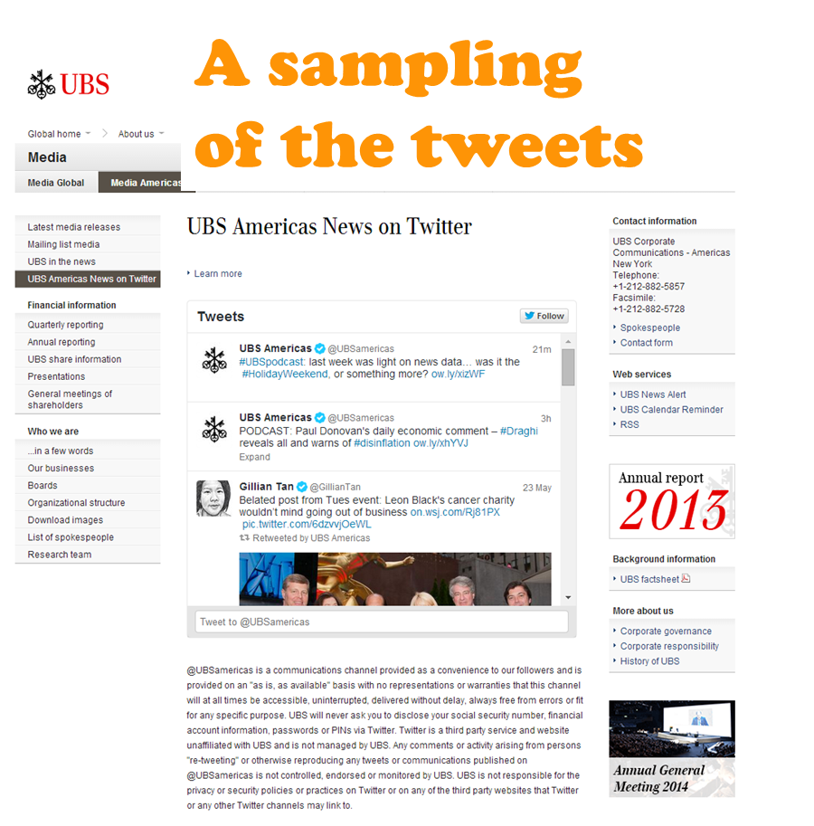
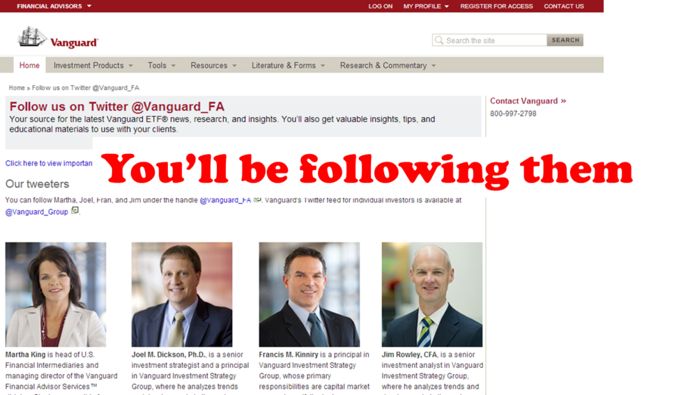
It’s conceivable that that some client/prospect visitors will discover the existence of social accounts not from participating on the networks themselves but while on your site. The UBS (by including a Twitter feed in addition to lots of other options in the left- and right-hand columns) and Vanguard (by including the tweeters’ bios) pages make room for that possibility. These pages could convert Website visitors to Twitter account followers.

Yay—MainStay’s “legal notice page” includes an attempt to convert visitors to email subscribers. A sample of what to expect might also help drive signups.

This T. Rowe Price page can be arrived at from the firm’s Twitter or YouTube channel account. "Conversion" from this page would involve a gain in followers for other social accounts.

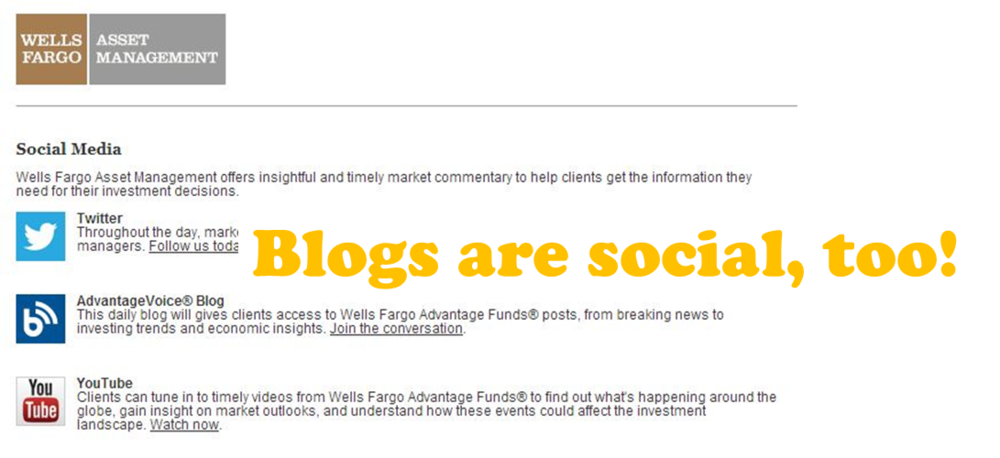
Finally, Natixis and Well Fargo Asset Management (shown below) include their own blogs in their landing pages’ social account listings. 


When thinking about re-opening your own kettle of worms, review your Web analytics to see how your current “landing page” performs. That should tell you all you need to know about traffic sourced from social sites.

For additional perspectives on social media landing pages, also check out these posts from other sources: 

How Does Your Content Look In Flipboard?

This post isn’t going to be for everyone. It’s a tad technical and requires you to get your hands dirty by popping the hood and at least exploring how your Web pages are made.

You may be tempted to bounce now.

On the other hand, as marketers, we’re known for sweating the details. The color of the firm logo has to be exactly right when printed on a four-color press. Some of us insist on using the full product name in all instances, even when those names do go on and on. Banners on booths have been ripped down because a comma was out of place.

If you care about all of the above, you may be willing to hang in here to consider some issues affecting how some investment management content appears on Flipboard, one of the most popular news reading apps available for iOS (iPad and iPhone) and Android smartphones and tablets.

Some Background

More than 100 million people use Flipboard, and it's regularly included among the top 10 apps recommended for financial advisors. If you’re not familiar with it, this Putnam wholesaler’s explanation will bring you up to speed.

Essentially, Flipboard provides the equivalent of a magazine reading experience by extracting content from user-specified sources, including blogs and social network accounts, and presenting them in an attractive layout. It's a personal magazine, I love it.

Here’s how Marcos Weskamp, Flipboard’s head of design, described its inspiration to Mashable in 2012: “If there is one element I've always admired from what [magazines] do, it's how every element placed in the page has a specific purpose. I just love how each story flows into the other one, how your eye can surf each page by jumping from headline to headline to photo, to pull quote and into an article. In the magazine world, each page is a small composition of a larger piece, and everything is in a way trying to pull you in to read the story. You can easily scan a magazine, and the moment something interests you, just dive in.”

Flipboard makes subscribed-to content more inviting to read. Theoretically, content that someone chooses to read through Flipboard should get a lift from the enhanced display, often including a related image, headline and a text excerpt. It’s a rich opportunity for content providers to draw more readers in.

The screenshot below is of a Flipboard page, illustrating how Flipboard can showcase content linked to in a tweet. 


Due Diligence On Distributed Content

A few years ago we only dreamt that our content would grow wings and fly to distant places. Today broad distribution on platforms other than investment firms' own domains is effectively extending the reach of what you all have to say. And, kudos to you for originating and sharing content that attracts a following.  

But with this extended distribution comes the need to be ever-diligent that others’ publication of your content is working as expected. Unfortunately, the Flipboard experience isn't ideal for all content. The presentation of some mutual fund and exchange-traded fund (ETF) content is disadvantaged in Flipboard, primarily because of what’s being extracted from the HTML and displayed. 

This post isn’t meant to call anyone out. It’s impossible to describe what’s going on without showing a few examples of issues that are occurring regularly and keeping people from exploring the content. We all need to look out for one another.

Oh, and I should say, if there's an adjustment that needs to be made to the way your content is displaying, it's not going to be Flipboard that makes the change.

Some Specifics

I regularly use Flipboard to keep up with tweets from asset managers. You could do it, tooall that’s required is a one-time add of the Rock The Boat Marketing Investment Managers Twitter list or any select Twitter accounts or other social media accounts you’re interested in.

Obviously, my view is of 100% investment management content and may/may not be the way most advisors or investors see your content on Flipboard. They may view your tweets as part of an everything feed. That raises the level of competition for attention. Also, the page layouts are dynamic. An excerpt that takes up almost all of a page one time may be reduced in size the next time you open Flipboard.

However, the reading experience itself is always the samethe composition of each page to be flipped includes multiple entries of varying sizes and accompanying images, all pulled by Flipboard’s algorithm. More about the algorithm later.

The most appealing content is what gets attention within Flipboard and when you’re in the habit of flipping through, the typical user is unlikely to notice let alone dwell on anything sub-optimal. There’s too much interesting stuff "flowing" on any given page, the reader will move on.

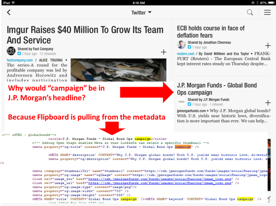
What prompted this post is something that I happened to notice about a J.P. Morgan Funds item in Flipboard.

Campaign? Why would J.P. Morgan use campaign in a headline?

Clicking through the excerpt to the page on J.P. Morgan’s site confirmed that “campaign” wasn’t used in the headline. But a check of the HTML shows that “campaign” is in the metadata of this page and many other pages.

Noticing this about a month ago has made me hyperaware of how investment manager content is being displayed in the Flipboard app. Most of it looks great. Firms that are sharing images and graphics should be attracting lots of eyeballs, especially. But upon closer review, it's dismaying to see how widespread some issues are: Headings and text that firms don’t intend or expect to be published are often showing.

The problems seem limited to links to content on firms’ own Website pages and sometimes just sections of sites as opposed to links to posts on blogs. Links to other publishers’ content seem to be displaying just fine.  

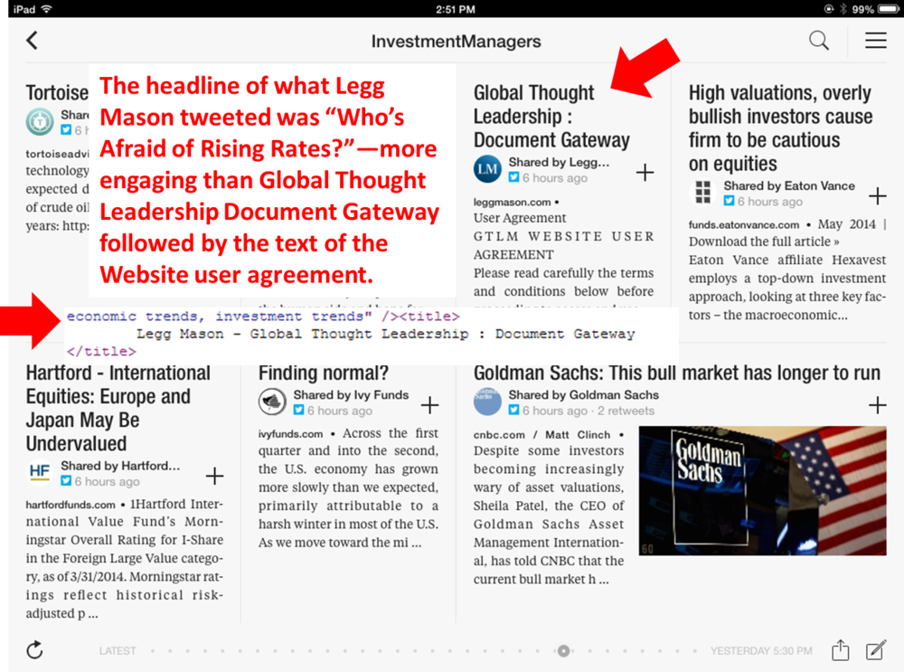
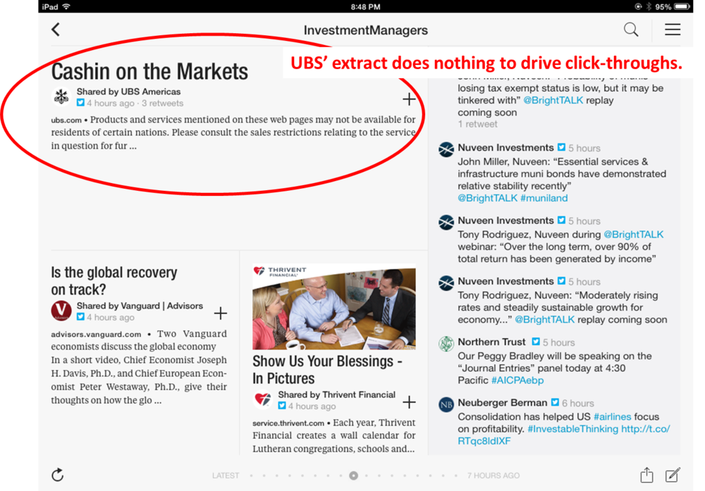
Sometimes—in the instances of the Legg Mason and UBS examples below—the extract is simply underleveraging the value of what’s being shared. The most common issue is that Flipboard is extracting a navigational heading referring to a type of content (e.g., Insights, Press Releases, Education and News Center) as opposed to the unique title of the work.

More people will be drawn to a headline like, “Who’s Afraid of Rising Rates?” than Global Thought Leadership Document Gateway. And note that the content extracted in the Legg Mason example is the Website user agreement.


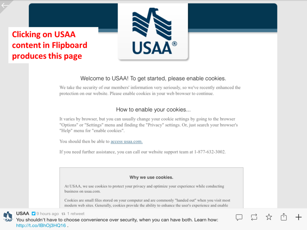
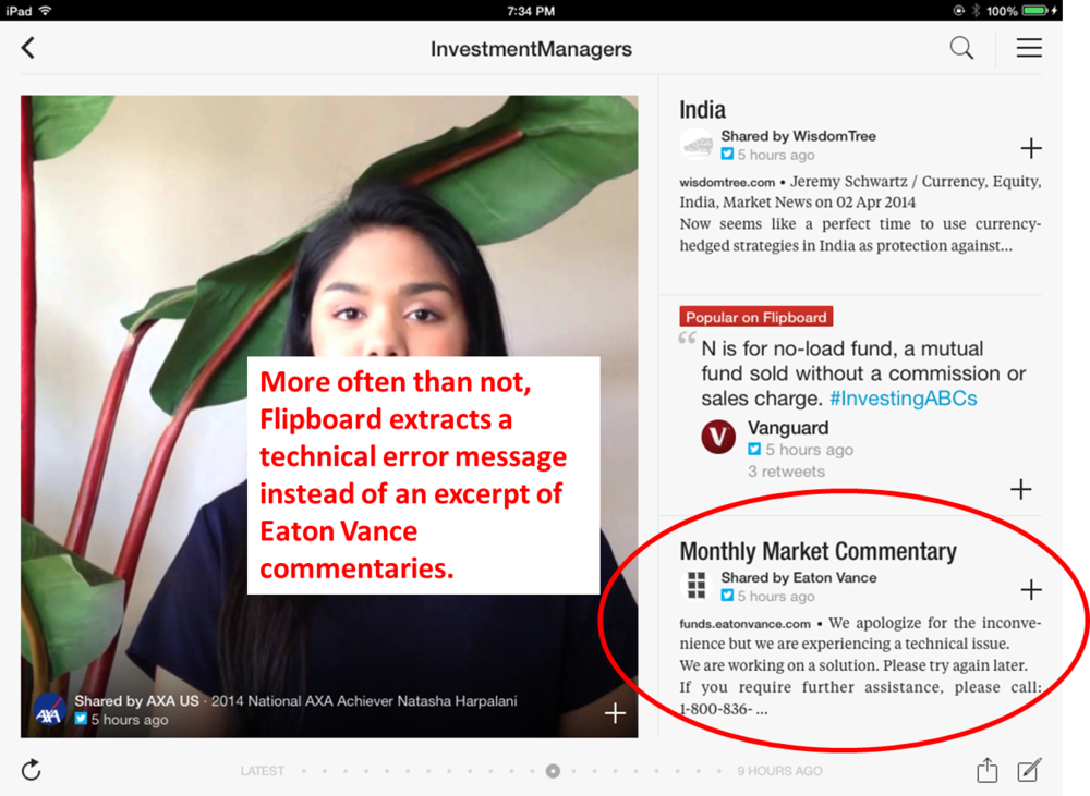
But certain USAA and Eaton Vance extracts show Website messages instead of content, and it’s apparent that something is not working as it should be. This is a lost opportunity, and then some.

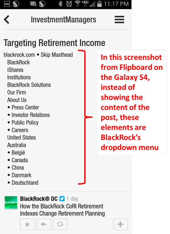
Most of the examples shown here are from the iPad app. The Flipboard smartphone apps use the same algorithm so the result is the same but mitigated by the fact that the content of the tweet is more prominent. Still, if you know that someone is taking the time to catch up with his or her news and you have a screen to yourself with which to engage the reader, it’s a shame to fritter the opportunity as is happening in this @BlackRockUSDC example below.

Addressing The Issues

The issues involving the titles may be able to be easily addressed, probably depending on your content management system. (And just a general word of warning to be careful about the words included in your metadata. A few years ago, the FDA ruled that the same rules that govern pharmaceutical companies’ advertising, labeling and promotion also apply to metadata. I wouldn’t rule out this industry’s regulators coming to a similar conclusion.)  

I’ve sent a few of these other examples to Flipboard, hoping they could provide some guidance, but after a month they haven’t had much to say.

Flipboard extracts are based on their algorithms, which they don’t share information about.  

One commenter on Quora speculated, “The parsing and extraction can be done by looking for relevant HTML tags (e.g. <p>) which contain the more textual content than usual; they also analyze other aspects of the HTML such as relative position (main content tends to be more centrally located), tag affinity (article text tends not to be mixed with lots of other types of non-text tags). Some algorithms use more sophisticated techniques which require it to be trained on sample data.” 

To view how Flipboard is extracting your social updates, look for your social account using the Search capability in the upper right-hand corner of the app. 

If Flipboard is publishing “the wrong” content, you have three obvious choices: 

  • You and your IT support will need to troubleshoot and ideally address the page-specific issues.
  • If you fail to identify a way to address these, you may want to take your limitations into consideration when selecting what to tweet or otherwise share.
  • You could choose to not be bothered by how Flipboard is displaying the content. 

Lots of attention right now is being paid to the Twitter profile changes, the deadline for which is May 28.

But remember that it’s a minority of Twitter users who read your tweets on your Twitter profile page. Much more likely is that they’re consuming the content you share in the app or news reader of their choice. As important as it is to make sure that the Twitter profile aligns with your brand, my recommendation is that you take care to also check out your content where and how your firm's followers are experiencing it.