The State Of The Art Of Version 1.0 iPad Apps
/ TweetUsers who download asset manager iPad apps also download apps like CNBC Realtime and Bloomberg, according to Apple’s App store. Gulp. That sets the bar fairly high for a Version 1.0 app from a mutual fund or exchange-traded fund (ETF) company.
Three asset manager iPad apps have launched in the last few weeks. Since it’s been almost a year since I blogged about an iPad app (PIMCO’s), I thought I’d take a look at how the state of the art has evolved, as demonstrated by the apps from OppenheimerFunds, Franklin Templeton Investments and RidgeWorth Investments.
I offer these notes from the perspective of an iPad user and of an investment thought leadership content consumer. I haven’t been involved in the planning, scoping, negotiating, cajoling and maybe even compromising that led to these apps’ launch. Bravo to all three firms involved—you shipped!
More Aggressive Promotion
If you read any of the financial advisor-ish Websites, you can’t have missed Oppenheimer’s ads in support of its Global Tracker app. It’s been reported that Oppenheimer spent $3 million on the advertising alone of this app, as an extension of its $12.4 million Globalize Your Thinking campaign.
Franklin Templeton also launched with a YouTube video for its app. And, it’s running a pay-per-click campaign. That’s more support than most earlier apps launched with.
Something else that’s different: As of this writing, all three apps are commanding front-and-center real estate on the home pages of their Websites. As it should be.
Device-aware Information
Each of these apps presents information or in a way that goes beyond what can be found on their sites—in other words, they provide a reason to use the app. (Example: In another March announcement, Fidelity launched a 2.1 iPad app that accommodates the depositing of an image of a check to a brokerage or IRA account—can’t do that on a Website!)
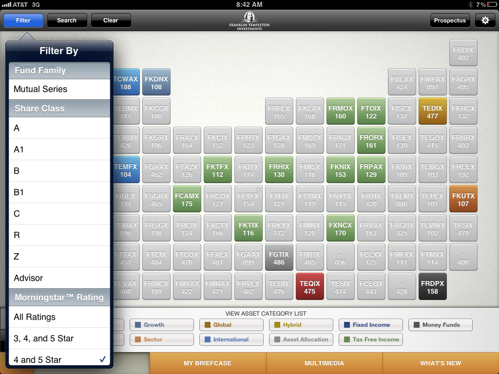
On its Website, Franklin Templeton offers limited filtering of its funds, but its iPad app really goes to town. This screenshot shows some of the options, including display by share class and display by Morningstar rating. Click on the fund to see more detail, including tabbed performance featuring peppy bar charts.

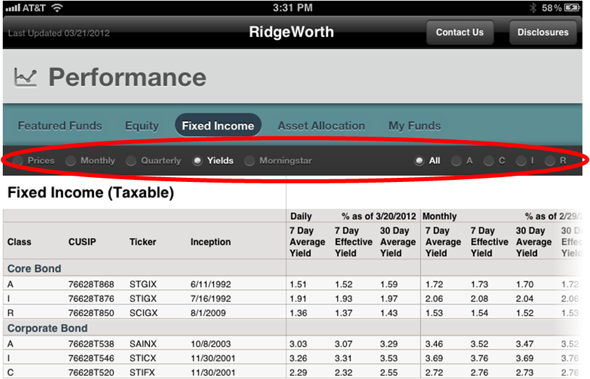
RidgeWorth’s app enables filtered views, as well, similar to what can be done on its Website. This screenshot is just the top of the screen, filtered to display only yields.

Both Franklin Templeton and RidgeWorth offer a way to customize views. There’s no email address or name prompt required to use either Franklin Templeton’s My Briefcase or RidgeWorth's Favorites. A hard close on the apps will reset to default settings.
The Franklin Templeton app extends its Website's My Cart functionality by enabling the saving of fund pages and video in addition to literature.
The public can register on the RidgeWorth site, and a logged-in user can save funds and favorites using the same terminology (My Funds and Favorites) as is used on the app. Imagine how cool it would be if information saved on the app was synchronized with information saved on the Website. NetFlix users who are accustomed to starting a movie on their TV and resuming viewing on their phone might in fact have that expectation. How many people (and who) would take advantage of the feature and is it worth the cost of development? That's the fund company app roadmap challenge.
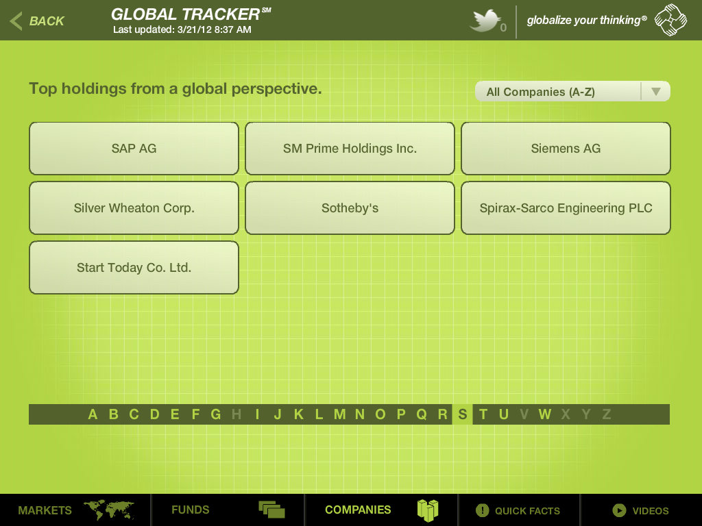
Oppenheimer lets a user click on a company name (navigated to from an alphabetical list) to learn which Oppenheimer funds invest in it. It’s the flipside of going to a fund and checking its top holdings. And, as mentioned in the video, the app provides far more information about a public company than you'd find on a fund site.

Navigation Required
Sometimes a user (especially a repeat user, which is what app publishers hope for) just wants to get somewhere. And yet, app-wide Search is not a capability of any of these three apps or really of most of the existing asset manager apps. Franklin Templeton does offer a limited Search (“fund keyword, symbol, number or…” on the Find a Fund screen). Oppenheimer could significantly add to the usefulness of the company information available by offering a ticker symbol search to its app.
But though I've seen and used Search on lots of other apps, I started to wonder if there was some technical hurdle that just too high. After looking around some, I did find an excellent search in an app from JP Morgan Asset Management in the UK.

Database-driven
These apps show off how the firms have structured both their fund performance data and communications assets. This is likely the result of years of planning—with data architecting work probably pre-dating the 2010 launch of the iPad—and it’s to the firms’ significant advantage.
Video And Audio Stand Alone
Including video and audio in an iPad app is de rigueur—don’t think of launching your app without. Next-generation versions of the Franklin Templeton and RidgeWorth apps might associate the availability of the video and audio files—available in one section of the app—with the fund profile available elsewhere in the app. Without such integration, these assets will be easily overlooked by the people who might be most interested in them.
Limited Communication Outside The App
As at every other business today, communicators at asset management firms are being stretched to think about communicating via mobile apps at the very same time they’re thinking about driving usage of their content offsite, including using social media. Far from being at odds, they complement one another.
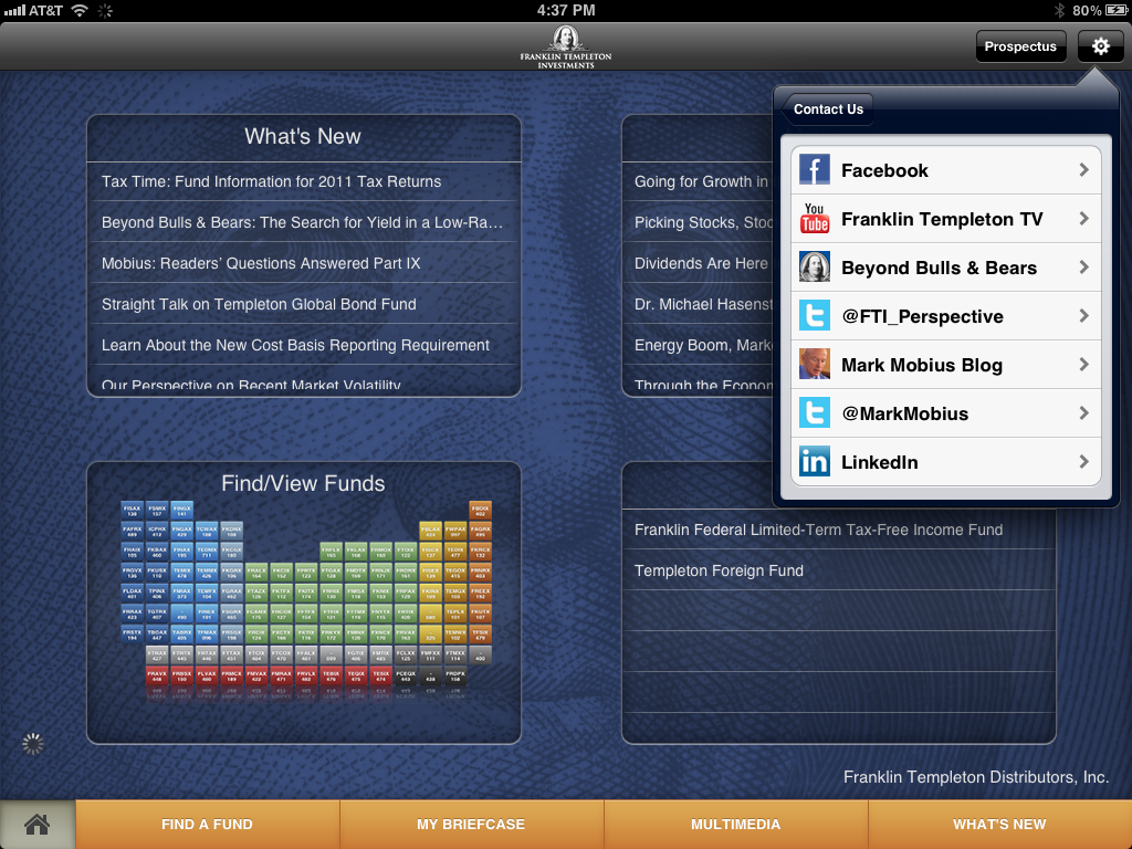
Yet, these apps offer awkward to no support for email and they support practically no native social sharing—even of the YouTube videos that offer full sharing on the firms' YouTube channels. The biggest nod to social is in the Franklin Templeton app, where the firm's social profiles are listed as a sub-menu under Contact Us.

Maybe this is a sore subject between Marketing and Compliance. If so, I hate to pile on, but sharing is getting to be a natural reflex—readers are used to sharing what they read as they read. As a marketer, I’d worry about the usage (and value) of content that’s confined within an app. More important, I worry about delivering a user experience that many iPad app users will consider subpar. Millions did not sacrifice to set content free on the Web only to lock it back up again on mobile devices.
Data Updating
The process of updating data is much more obvious on these 1.0 apps—the Global Tracker displays a progress bar and there's a delay every single time the app is opened—than when compared to other data-intensive apps. Hopefully, subsequent versions can display something while the updating takes place in the background.
So, have you checked out the latest apps? What are your thoughts?


