Are Fund Companies Becoming Invisible To Investors?

What if fund companies have been going about this all wrong?

What if the decision to focus on distribution as opposed to end-users has been a mistake?

What if years of business-to-business brand-building should have been directed at building a consumer brand?

What’s the future for product manufacturers whose users don’t know their names?

These are a few questions raised by research released Monday by Hearts & Wallets, a financial research platform for consumer savings and investing insights working with its database of 5,500 U.S. households augmented by focus group work.

“In a grave strategic error, investment product managers have allowed their offerings to become commoditized,” Laura Varas, Hearts & Wallets partner and co-founder, said.

Hearts And Wallets Product Awareness.png

Varas gets to this conclusion by pointing to data that shows a decline in product awareness across all lifestages. At the same time, awareness of asset allocation—something distributors provide—is increasing.

In 2010, 76% of U.S. households knew what investment products they owned.This year, 66% do—a 10 percentage point drop in five years.

The study Product Trends: Ownership, Allocations & Competitive Metrics, whichdetails product ownership trends and opportunities within all lifestage, wealth and age segments, finds that only 54% of the Mass Market could say what types of investment products—mutual funds, ETFs, individual bonds etc.—they own. That’s down 14 points from 68% in 2010.

“This trend is yet another sign of how product manager attentiveness to distributor needs, while ignoring consumers, has allowed retail financial distributors to gain the upper hand in satisfying the needs of the ultimate decision-makers–consumers,” says the press release headlined “Wake-Up Call for Investment Product Managers.”

Oh and also, the firm adds, “the loss of power among manufacturers is exacerbated by the white labeling trend in the defined contribution space. Investment menus are shifting from manager-branded portfolios to generically named options in which money management firms are virtually hidden from participants.”

Meanwhile, Distribution Awareness Is High

“We believe it behooves major investment companies for consumers to be aware whether or not they are shareholders, even if the products were selected by an advisor,” said Hearts & Wallets.

The firm measures this with a Shareholder Awareness score.Vanguard and Fidelity have the most aware shareholders—two-thirds of all shareholders are certain that they are those firms' shareholders. Among purely third-party distributed funds, American Funds leads with a 50% awareness score followed by BlackRock, which has built its score up to 47% from 41% in 2011.

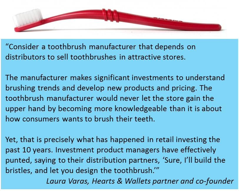
Hearts  Wallets Toothpaste.png

By contrast, 90% of consumers nationally can answer questions about at least one “store”—which is how Hearts & Wallets refers to retail and defined contribution providers that work directly with investors. Just as a Cuisinart blender is available from Bloomingdale's, an American Funds fund might be available from an Edward Jones store or a BlackRock product from the Fidelity store, it explains to focus groups.

The focus group discussions yielded additional troubling insights.

"Participants said they once had expectations for product, but no longer did. And they said they felt most products are the same; products are not perceived as adding as much value as stores," the firm reports.

Even for a third-party distributed fund company, an “extreme degree of disconnection with the consumer” has many disadvantages, according to this explanation from Hearts & Wallets:

  • It puts the product managers entirely at the mercy of the “store.”
  • It deprives the consumer of knowing that the manager cares about them; many, if not all, of the managers care deeply about their shareholders.
  • It deprives product managers of the opportunity to engage with people who are aware of, and presumably interested in, their brand.

Making The Invisible Visible

IntelInside.jpg

On the flipside, marketers could no doubt list several arguments in favor of having a strong connection with users of their products.

Think of the legendary "Intel Inside" branding campaign that dates back more than 20 years. Its success in promoting the importance of a branded semiconductor chip (a commodity if there ever was one) in other manufacturers' computers powerfully drove sales and built brand loyalty.

Intel Inside inspired multiple subsequent “ingredient branding" efforts—what marketing professor Philip Kotler referred to as “making the invisible visible.”

You and your firm may want to review the Hearts & Wallets data. See whether it piques your curiosity about the level of your shareholder/investor awareness and its potential impact on your prospects for growth. The research prompted the following random thoughts from me this week.

The role of the relationship. As fascinating as I find the work and the conclusions, Hearts & Wallets' comparison of retail investment product distribution to consumer products and stores isn’t apples to apples. Toothpaste isn’t sold by anyone who seeks to have a relationship with the buyer. There’s a difference between the context of a consumer product transaction and an investment product selected for an outcome-oriented investment portfolio.

That said, I'm reacting to what I’ve seen that the firm has shared publicly. There’s more in the full study, which also includes “insight into innovative product solutions to help product manufacturers regain some balance with distributors.”

Content requires distribution, too. Embedded in asset managers’ reliance on others for product distribution is a reliance on others for content distribution. Every brand needs to distribute their content but investment brands especially so.

As I’ve commented on previously, mutual fund and ETF sites are product manufacturers’ sites. Their full product specs include information that other sites won’t. But, most product-related traffic goes to distributors’ and others’ domains.

It's just a consequence of today’s business model that when using thought leadership and other content to raise awareness and to demonstrate relevance, asset managers rely on others’ platforms to reach others’ audiences. As with product distribution, this makes firms dependent, can be costly and complicated, and subordinates the fund company brand.

A two-track approach. Let’s suppose that that you find a slide in your retail investor awareness and your firm is determined to reverse it. The effort would take at least two tracks: reaching current investors and reaching the public in general.

Together, omnibus accounts and overall intermediary pushback (i.e., who’s relationship is this, anyway?) present practical challenges to the prospect of elevating the brand to current investors. The greater opportunity will be with whatever marketing, media, public and community relations can accomplish.

Hearts & Wallets’ release recalled the 1990s when “high product awareness prompted consumers to seek out products like the Magellan Fund ofFidelity Investments, which was once the world’s best-known mutual fund.” That was the fund managed by iconic manager Peter Lynch.

For 2015—a disruptive time for every piece of retail investing from the products to the distributors/advisors to the users themselves—effective awareness-building would need to go beyond the promotion of a star manager or two.

Budget-busting. Any strategic decision to reach out to the retail investor would be an expensive one across the board. Brand and advertising is already the largest percentage of asset management marketing budgets, according to SwanDog Strategic Marketing benchmarking work. But most firms today focus on media that helps them reach 300,000 financial advisors. Add retail investor-focused ad buys, inbound marketing, analytics, etc. and you are talking big money.

An ETF advantage? This data would seem to temper what we can expect from mutual fund firms that are getting into the exchange-traded fund (ETF) business. Product awareness is a prerequisite to brand loyalty or brand affinity. If awareness is low, the fund company new to marketing ETFs, whether to advisor-assisted or self-directed investors, may be diversifying product lines with less of an advantage than it realizes.  

A shift in the power dynamic. Who in the typical intermediary-focused organization best knows the consumer? The people who answer shareholder inquiries and (wait for it) those who've recently become involved with the listening and responding responsibilities of social media. A serious commitment to pay attention to consumers would require the building out of resources, conceivably shrinking—even if just a bit—the influence of the wholesale sales organization.

Regarding social media, specifically: Given access to platforms with millions of consumers, is it a miscalculation for firms to instinctively want to fence off an account or area with content directed at advisors? I'm beginning to wonder.

Your thoughts?

A First Look At Fund Website Benchmarking Data

Digital marketing success isn’t defined in terms of Website traffic. There’s so much else to consider.

However, benchmarking data on the overall level and composition of your site traffic vis-à-vis your competition can be useful. You’re appealing to the same broad audiences, and their behavior on related sites should have some meaning for you.

This is a follow-up to last October’s post about the return of benchmarking to Google Analytics. Now there's data to analyze! Here's a first look at it.

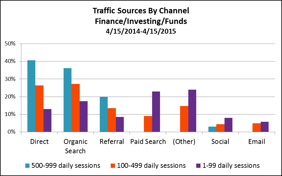
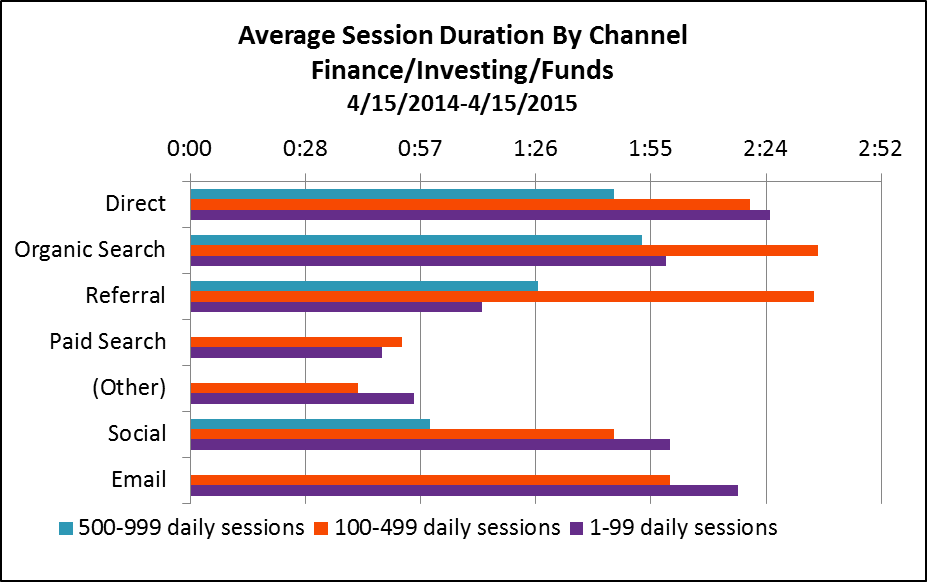
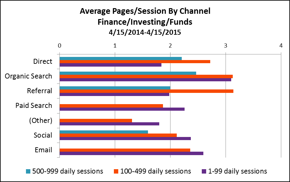
The graphs below reflect 12 months of activity (April 15, 2014-April 15, 2015) on 426 fund Websites whose firms have opted in to share anonymized data to enable benchmarking.

The sites are grouped by number of daily sessions, and the data in the graphs are based on three groups: 0-99 daily sessions (sample=377), 100-499 daily sessions (sample=29) and 500-999 daily sessions (sample=20). Google doesn't yet have a large enough sample to report on fund sites with 1,000 daily sessions and more.

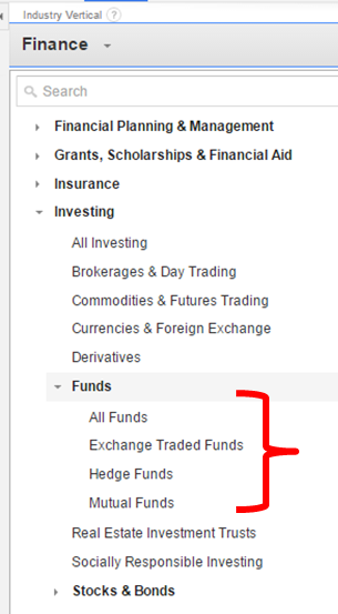
All data can be found in your Google Analytics account. Just go to Audience/Benchmarking. I looked at data at the Funds level (including mutual funds, exchange-traded funds [ETFs] and hedge funds), exported in Excel spreadsheets to be able to work with it.

This is more real (not based on user panels but on actual data that Google is collecting on sites) and more granular (most free benchmarking services stop at Finance or Investing in general, which includes brokerage sites).

Still, the benchmarking will be even more useful:

  • When mutual fund and ETF site benchmarking data is able to be reported separately. That can’t happen until a sufficient number of properties agree to contribute data. If your firm hasn't yet opted in, you might want to consider. More on that in my previous post.
  • When some category inconsistencies are addressed. Google has no trouble recognizing direct, search (organic and paid), referral and even social traffic. But if site publishers aren’t using tracking code to distinguish between display and email traffic, Google may mis-categorize it as direct traffic data. You’ll see below that Google benchmarking data is being reported for paid search, other paid traffic sources and email for the less trafficked sites but not for the most trafficked sites.
  • When you isolate your own peer group and delve in. I’m presenting the three groups together to get a high level sense of fund company Website traffic in 2015. Compare your site's traffic to your peer group and you’ll learn more.

A Few Takeaways

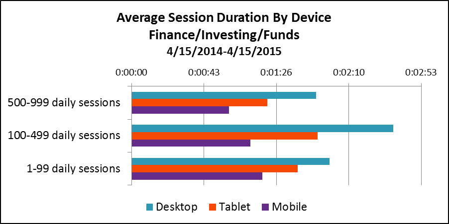
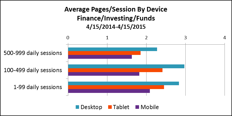
1. Overall, it looks as if the most that a fund site can hope for are a couple of minutes of the visitors’ time and a couple of pages viewed. This data suggests—let me amend that—makes the argument for easy-to-find content on sites that anticipate the task-oriented visitor. They come, they get, they go. Not that there's anything wrong with that.

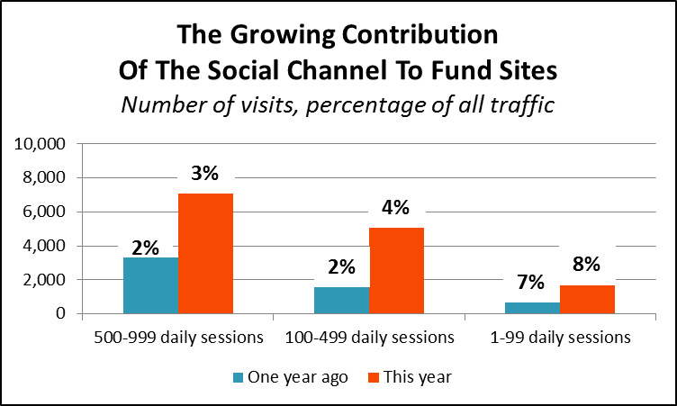
2. Finally, we have data on the contribution being made by social efforts and by email—two areas that there is great interest and investment in.

In fact, see the growth in the total number of sessions driven by social in the most recent 12-month period over the previous period. Benchmarking data is available only from August 28, 2013, so the earlier period comparison is from 8/28/2013-4/14/2014, eight months versus 12.

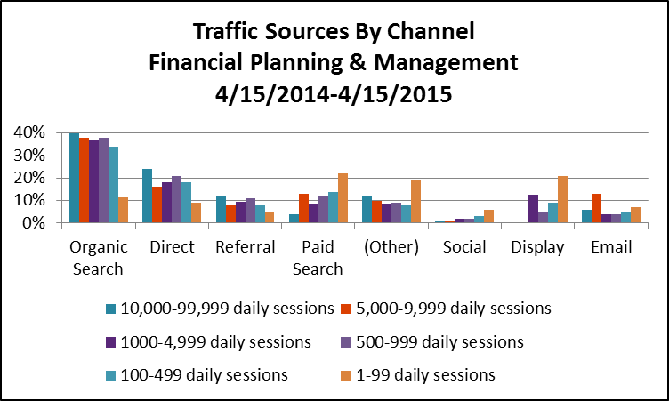
3. Direct traffic (a reflection of brand awareness and product familiarity), organic search (a measure of content availability, quality and accessibility) and referral links drive the better trafficked Websites. Less trafficked sites rely on paid search, other advertising and organic search.

4. There’s a difference in the traffic sourced by each channel: Direct traffic, organic search and referrals lead to more longer-duration sessions, with more pages viewed.


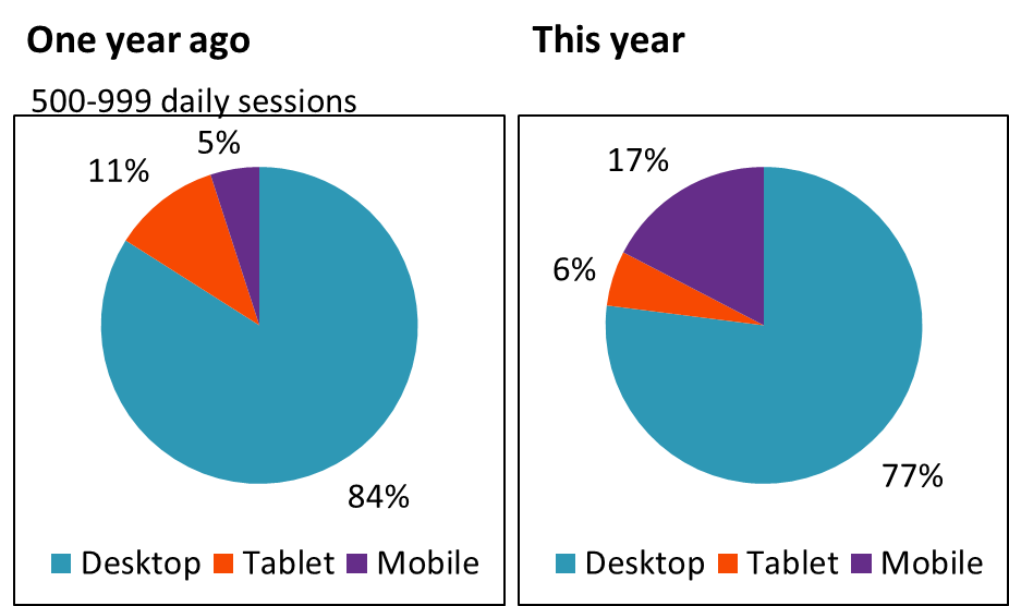
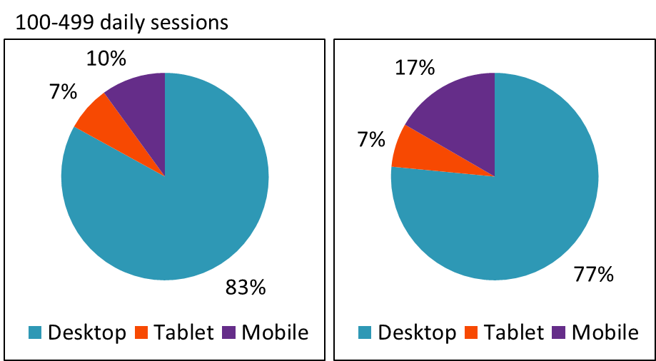
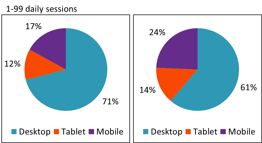
5. Just about one out of four visitors to fund sites comes from non-desktop devices (e.g., tablets or smartphones). This is a remarkable change that has undeniable implications for sites created for desktop use.  

6. Desktop sessions last longer than mobile sessions, which is to be expected. But, there isn’t a big difference in the number of pages viewed across devices. Here too, it’s few pages across the board.

Drilling into your firm’s analytics will help you understand whether this is a good or bad thing. It’s good if you can see that visitors are immediately finding what they need and then moving on. Not so good if the short visits point to visitors—even more frustrated because they're on smaller screens and possibly on the go—who give up.


An Over-The-Shoulder Look At Advisor Sites

Out of curiosity, I also looked at the benchmarking data of sites that are in the Financial Planning & Management category, which together represent about 6,800 Web properties. Nine out of 10 of these attract fewer than 100 daily sessions. Google reports data on sites attracting as many as 10,000-99,999 sessions.

Make no mistake about it—many financial advisors are turning to the same content marketing and paid search tactics that asset manager sites use to build awareness and drive interest. I spotted certified financial planner Jeff Rose ranking for "Roth IRA" searches back in 2010, and more advisors have gotten more serious about inbound marketing since. (In fact, see FMG Suite’s 2015 Inbound Marketing award winners—there are some impressive marketers on that list of financial advisors.)

Few advisory firms may enjoy the brand recognition of your firms or the marketing budgets. The benchmarking data gives us an idea of the organic search strength among financial planning sites.

And there's more—but I'll leave the rest for you to explore.

Yes, But...How Fund Marketing Is Evolving

There’s a striking evolution underway of investment product marketing/communications. You may need to use a machete to find it, cutting through all the market insights, retirement and personal finance updates that overwhelm asset manager content streams. But look at just the product-supporting communications that are being created using modern-day publishing tools and you'll see what I mean.

There’s no question that we were due for a change, as I was reminded of Sunday via a tweet that I was cced on (yes, that’s a thing).

Tom Brakke aka @researchpuzzler lifted a “fund marketing flowchart” from a partial book draft written in 2000 by Clifford Asness, founder of AQR. Asness described the chart as a decision-making model.

Now, I might have been tempted to dismiss this as nothing more than nostalgic. But three accounts retweeted this Sunday morning tweet, six accounts favorited it and one account piled on. @MikeCraft6, a self-described “bond fanatic,” suggested that a fourth box be added: "Merge Fund into One of the Above."

I don’t know for sure that Brakke—an investment advisor and consultant respected for his views on investment management process and communications; I’ve mentioned him before—meant to bait me. But I took the tweet and the response to heart.

Fund performance advertising has been hated since well before the year 2000. It’s easy to understand why. The basis of the derision is that performance records aren’t something anybody can safely use. As has been repeatedly documented, too often investors felt suckered into “hot funds”—what we advertised. Craft’s add-on jab about merging funds just underscores that “fund marketing” has a trust problem that continues today.

Fund Marketing > Performance Advertising

We did more than performance advertising 15 years ago, but I’ll concede that performance advertising may have been the most outward sign of fund marketing dollars at work. Advertising space purchased to showcase a table of index-beating returns was a concise presentation. The results were offered as a shortcut for what there wasn’t room to say about how those results were produced. Good numbers were enough to get everybody's attention.

The top performers were the funds advertised, absolutely. This is a point that Asness said he had no issue with. “There is hardly a business in the world that insists on pushing its ugly tough-to-sell products as hard as its attractive ones,” he wrote in his book draft.

“Furthermore, if investors insist on shunning anything doing poorly recently, and buying only recent winners, it would be very unfair to blame only the fund companies for the selective advertising practices I discuss. They should not be required to tilt at windmills.”

Excellent, we’re off the hook with the man who created the flowchart in 2000. But it’s obvious—not just in this week’s tweets but elsewhere, including Brakke’s comments on this blog in December—that marketers need to do more than promote performance in order to build trust in mutual fund and exchange-traded fund (ETF) communications.

Unbounded by the constraints that limited Marketing's ability to communicate previously (i.e., explicit budget, production/delivery time and expense, and physical space to accommodate the message), today’s product communications are extending in many new directions.

Fund marketing is more than the one-trick pony that some may still see. Yes, space is still being purchased and top-performing funds are still being advertised. But the URLs and social icons included on the ads? They lead to a wealth of additional information that should foster smarter investment decision-making—hopefully resulting in fewer of those gotchas that sting advisors and investors.

As a test Sunday through Wednesday of this week, I sifted through the tweets sent by asset managers (as tracked by the Investment Managers Twitter list) and followed the links to just the product communications. This sample of this week alone suggests a bit of what’s changed since performance advertising defined fund marketing 15 years ago and more.

Going Direct

Access to their own publishing platforms enables firms to go direct, overcoming the budget and finite space limitations of using a media partner to reach advisors/investors. A regularly updated blog combined with social network updates provides for relevant, time-sensitive and friction-free communicating about much more than performance.

For example, here’s AdvisorShares, which weekly takes it upon itself to report on the active ETF market share, including tables of outflow and inflow data showing other firms’ funds.

And, of course, fund companies aren’t the only ones practicing their new publishing skills.

In the office today, marketers continue to sweat over the display and use of brand assets. Meanwhile, there’s a whole community online that’s also newly empowered to share their own text and graphic commentary about your products in the open on the Web.

While short-term performance consumes a significant amount of the attention of those posting to Seeking Alpha or StockTwits, other attributes are discussed as well. Below is a tweet with a screenshot that shows the changes in an ETF’s assets under management. For those paying attention, these product tweets provide insights on what's interesting to others about your products.

Multi-threaded

Previously, fewer than a handful of funds received extra marketing support. Those were the funds whose impressive performance made it easy for wholesalers to engage advisors. It was a backward-looking approach, no question.

But today's product-focused blogs support multiple products. It’s the rare firm that hammers home one fund and ignores all others.  

In addition to aiding investor understanding, this multi-threaded support serves at least two purposes for a firm:

  • It showcases the thinking of all the teams. The “global breadth and depth” of the firm is made real with posts from a blogging stable that includes portfolio managers, portfolio strategists, investment and research analysts.
  • A continuous (vs. sporadic) focus assures a ready supply of content, which will help when the market rotates and there’s heightened interest.

Check out Franklin Templeton’s Fixed Income Almanac, a new "one-stop shop" for portfolio manager perspective and historical data.  

Back in the day, portfolio management had a top-down, locked down approach to being available to Marketing. As a former shareholder report-writer, I sometimes wondered whether the goal was to reveal as little as possible.

This kind of thing from Motley Fool Funds just wasn’t happening in 2000.

From Advisor-Only To ‘Please Share’

Content-sharing isn’t a new concept to fund marketers. But the party line has changed quite a bit. Having thrown in the towel on keeping advisors from sharing product content with their clients (more can be said when the content is prepared for licensed professionals), marketers now are motivated to create shareworthy information.

With this enlightenment comes the recognition that it’s a short list of people who are going to share your product performance data with their social networks. Performance is only one attribute of an investment product and maybe even the least differentiating. There’s also the fund’s story including its process and its holdings, its portfolio management (often featured in old tyme advertising but in a more distant way), its role in a portfolio, its expenses (the focus of many ETF communications).

The qualitative information that’s provided via these product communications is something that robo-advisors aren't able to factor into their algorithms. 

Where previously we would have relegated a risk discussion to the smallest typeface at the bottom of a printed page, check out WisdomTree's 800 words on risk.

The post comes to a favorable conclusion regarding the index underlying the EPI ETF. But does that mean that this content is little more than self-serving?

If we were talking about those posts that begin with, “Is it time to consider (insert product category here)?” I’d have to agree, yes. Not a fan. But WisdomTree's elaboration leads to a more informed buyer of its ETF after a run-up.

And then there's this Rochester Funds tweet about Puerto Rico sales tax collections. It’s a narrow, product-related update that couldn’t have been effectively distributed, and wouldn't have commanded any marketing support, in the old world.

Storytelling possibilities expanded with the rise of ETFs and specifically slice-of-the-market ETFs. A story is much easier to engage with than past performance.

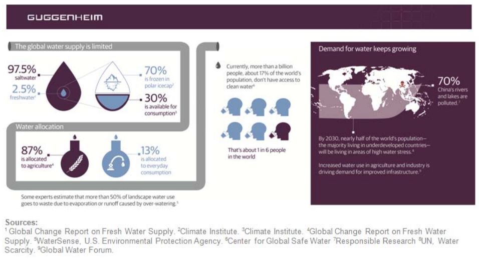
See this infographic on the global water supply, which Guggenheim distributed along with its press releasecommemorating World Water Day 2015. Guggenheim started with why and then closed by focusing on water “as an attractive investment opportunity” and its global water ETF CGW. 

Sometimes—as happens often with PureFunds’ tweets—the connection between the story (another cyber hack) and the solution (the cyber security ETF HACK) is short and sweet. This series of tweets represent a whole different interpretation of drip marketing.

It Takes A Village, Not A Family

The presentation of products on fund company Websites has improved immeasurably in the last 15 years.

But for this post on product marketing, there’s one change worth mentioning: The opening up of fund comparison tools to include all products. It really wasn’t so long ago that these tools were limited to building portfolios with just the Website sponsor’s products, the so-called family of funds. I believe that Putnam deserves credit for blowing that model up, and most if not all firms have followed the lead.

This represents a shift in understanding toward a practical emphasis on how the products can be used. In isolation, past performance helps not very much. Over the years, marketers have learned that fund providers should help with how their products work with others' products.

Content-wise this week, Nuveen offered almost 12 minutes on to how to use small caps in a portfolio and Ivy Funds commented on using a commodities allocation. Wells Fargo Advantage Funds launched a month-long series on using alternatives.

If you’ve been on the inside these last several years, the changes occurring aren’t news to you. The social launches, the video production, the whitepaper manufacturing all have added both to the workload and the expectations of fund marketing. And, you have the best understanding of how much more there is to do.

Will this work serve to bolster trust among those unimpressed by the attention given hot products? I believe it will, with more, and more relevant, communicating yet to come. As always, your thoughts are welcome below.  

A few of the examples above are from firms that I have worked for or currently work for. To exclude them from a round-up post would be to penalize my clients. However, I was not involved in/compensated for anything cited above. When I refer to something that I’ve done for a client, I disclose it.

Now For Something Different: Morningstar’s Performance Clock

The old way involved closed doors, guarded discussions and hushed voices until an organization was ready to unilaterally spring change on its business partners and customers. (And we wonder why that didn’t always work so well?)

That’s not how change is introduced today. More often than not, the new way starts with an idea—sometimes not fully baked—and involves pilot tests, trial balloons, beta launches and other forms of vetting by "the crowd."

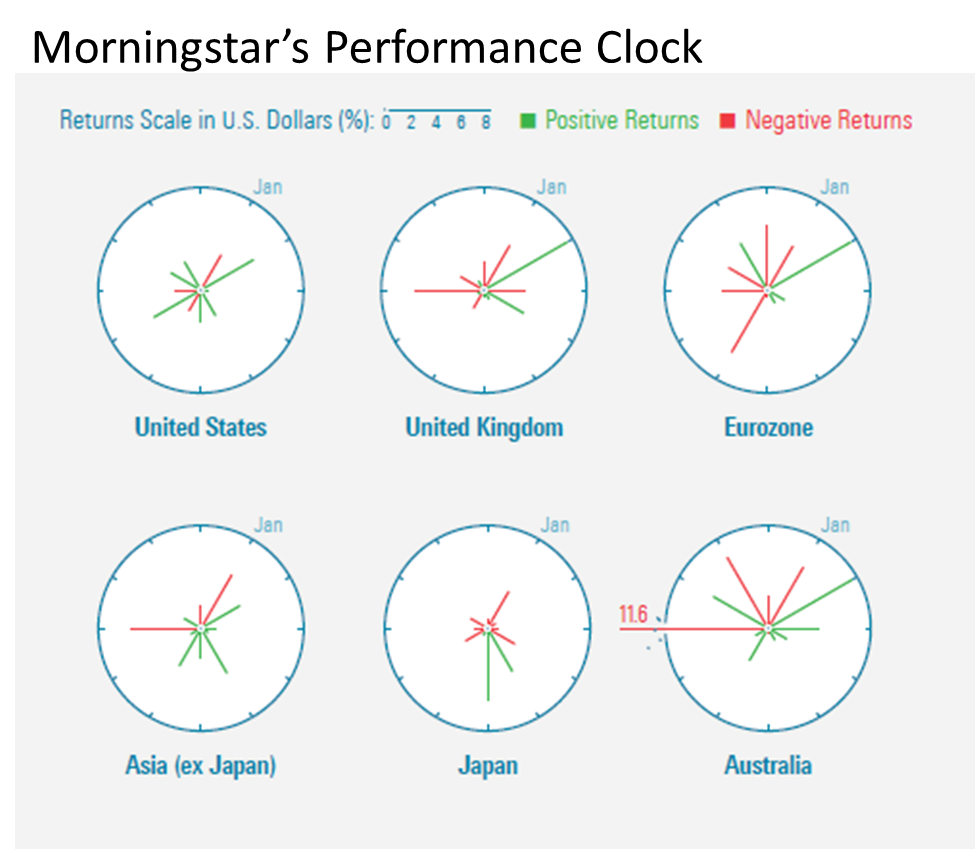
For example: Have you seen the “performance clock” published in the February/March 2015 Morningstar Magazine? This link will open page 34 of Morningstar’s Nxtbook magazine reader, you might need to give it an extra second or two.

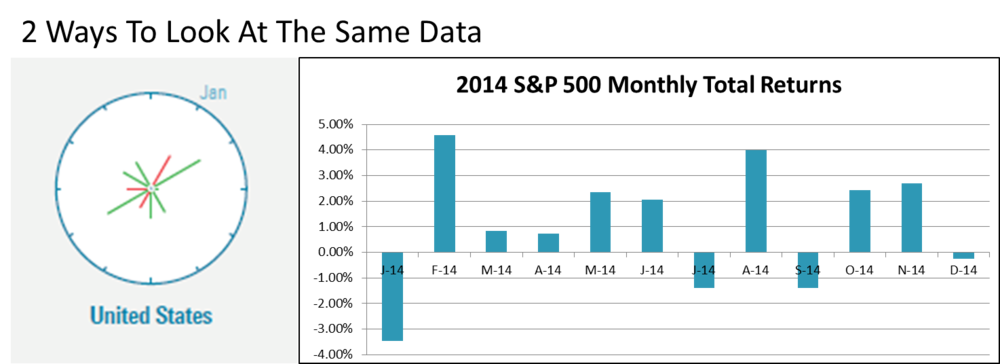
The performance clock offers a different way of looking at monthly returns of indexes or securities over time. It appropriates the face of an analog clock, showing monthly returns for the 12 months of a calendar year. The length of each line shows the absolute performance for each month. January is at the 1 o’clock position. Green lines present positive months and negative months are shown in red. When the returns or losses are small in some months, the lines very short.

“We’re thinking of making it a regular feature in our Data Dashboard toward the back of the magazine,” Editor-in-Chief Jerry Kerns told me in a response to an email I’d sent. “It would track the performance of [market] indexes throughout the year.“

In the note accompanying the feature in the magazine, Kerns asked for feedback, including whether Morningstar software users would want to see an interactive visualization. Per the new way, why invest programming resources unless there’s some demonstrated user interest in it?

Morningstar acknowledges that the visualization conveys the same information as a standard bar chart. In answer to a direct question from me, Kerns said, “I think it could replace monthly bar charts. It hammers home that volatility comes not just from the downside.”

Kerns elaborated, “I think the clocks work best when they’re being used to compare or provide context. Say that the performance of two funds with similar mandates is correlated—both funds produce positive and negative returns during the same months. But what if one fund was more volatile—its up and down months were more extreme? The performance clocks of these two funds, presented side by side, would show that. The volatility of the one fund would really stand out.”

I like the clocks and found myself spending much more time with them than I would with bar charts. I appreciate new efforts to aid investor understanding. At the same time, I should admit that I’m a pushover for whatever's new.

Does The Clock Toll For You?

Every mutual fund and exchange-traded fund (ETF) marketer knows to keep an eye on what Morningstar’s up to. In fund communications alone, we have Morningstar to thank for introducing the style box (in 1992, according to this corporate PDF) and of course there are the star ratings that appear on most fact sheets and fund profile pages.

I wouldn’t rule out the possibility that a new and improved visualization from Morningstar might eventually influence your presentations of market or fund performance.

Who else has a say in how fund companies present data? The financial advisors who distribute your products, the wholesalers who represent them, FINRA, Compliance, your fund data automation vendor, in-house designers all have a stake, too.

Just to test the waters, I reached out and asked Synthesis and Kurtosys, two marketing communications automation solutions providers mentioned here before—see this post and this—for their reactions. These people are information design professionals, with the battle scars from having to automate scads of data, graphics and text for an array of asset manager communications. They are not easily impressed.

“How would the performance clock work, either in fund fact sheets or online?” was what I wanted to know.

Some Reservations

Stipulated: There’s no doubt that a tabular presentation of fund return data is the most complete information a fund company can provide. If the clock visualization was used to present fund performance and/or index performance, it would likely be supplemental as most fund company graphics are.

Even so, the fund automation vendors have their reservations.

On the plus side, said Synthesis product manager Noel Rodolfo, “One of the benefits of this chart is that it should take up less real estate than a bar chart (even with data labels added, as I would suggest). And the clock hands’ length is the absolute value since positive/negative is denoted with a color. Nice, that will save some space.”

However, Rodolfo noted that reliance on color alone for positive and negative returns will be a challenge for the color blind. Ultimately, he thinks a benchmark comparison—involving two clocks side by side—will be more difficult and take the user too long to analyze the differences.

“I’ve seen these charts used by the fund ‘technicals’ on an institutional level, at French and Swiss firms mostly,” said Matt Stone, marketing director for Kurtosys.

Stone called clock charts interesting but confusing. “They save space and can help report on seasonality, but they are frighteningly hard to read for most. Both the positive and negative values go in the same outward direction.”

Stone said Kurtosys doesn’t see much reinventing of the wheel related to fund performance. On the other hand, marketers are turning to infographics for “the freedom to experiment and be more original. But the aim,” Stone reminded, “should always be to provide clarity, precision and efficiency.”

Your turn—whether you’re a marketer, financial advisor or Other—to weigh in on the performance clock. Your comments are welcome here, of course. You might also want to share your thoughts with Kerns. After all, early response from our crowd should be the benefit of Morningstar’s providing a first look. 

Commenting On Asset Manager Websites—And Some Said It Would Never Happen

In the brief history of blogs on mutual fund and exchange-traded fund (ETF) Websites, the stickiest point of contention between Marketing and Compliance has been the ability to accept and respond to comments.

Marketing: “But if we don't allow comments, how is this different from any other page we publish with market or investment commentary?”

Compliance: “Well, you’re the ones who want to call it a blog.”

As it happens, this stalemate was short-lived. In the last few years, marketers have prevailed, successfully making the case for the benefits to the firm of using comments to listen, learn and demonstrate responsiveness. 

Quite a few firms have opened their sites and blogs to comments. Such permissions have been accompanied by yards of moderation rules and disclosure but that’s to be expected.

Even in the absence of comments, there are more and more signs of a firm’s desire, or tolerance, for a two-way dialogue. And, the hint of the presence of a community can be found on domains controlled by asset managers.

I believe that firms’ generally positive experiences fielding comments on platforms they don’t control (Facebook, Twitter and LinkedIn) have led to less anxiety about the risk of comments posted on sites they can control. Moderation capabilities—including simply choosing not to allow the posting of a submitted comment—can go a long way. It’s also true that the firms are not the troll target that many feared.

Here’s a quick status report on how asset managers are inviting feedback on the content they publish. I should note that this review is happening just as a few well trafficked Websites such as Bloomberg Business and Copyblogger recently dropped comments. They say conversations belong on social media.

Go Big

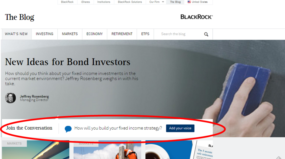
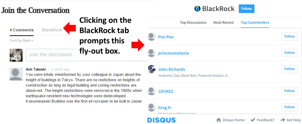
The BlackRock blog has started to embrace commenting in a big way. See the center bar on its home page which contains a question related to the most recent post. The Add Your Voice button links to a comment box at the bottom of the post. Clicking on the BlackRock tab prompts a flyout box showing rankings of all discussions and commenters.

Last September, we looked at BlackRock’s advisor community site, which was an ambitious undertaking. This is a natural extension for the firm to encourage blog visitors to “join the conversation” and, from the looks of it, relatively simple to execute using a Disqus integration with the WordPress blog.

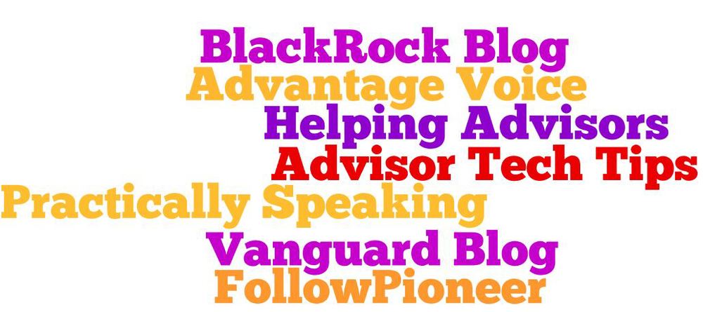
Blogs that publish comments are some of the industry's best, including Pioneer’s FollowPioneer, Putnam’s Advisor Tech Tips, Russell Investments’ Helping Advisors, SEI’s Practically Speaking, Vanguard's blogs and Wells Fargo’s AdvantageVoice.

Social Sharing Icons

Simply put, if you'd like your content to be shared more on social platforms, your site or blog needs to offer social sharing icons. And, sharing can be a prelude to commentary that happens on those platforms. This is out of the moderation reach and, unless you have systems in place, out of the awareness of some firms.

I commented on the growing prevalence of the icons on mutual fund and ETF sites, including blogs, in a 2011 post. However, some firms continue to face Compliance resistance.

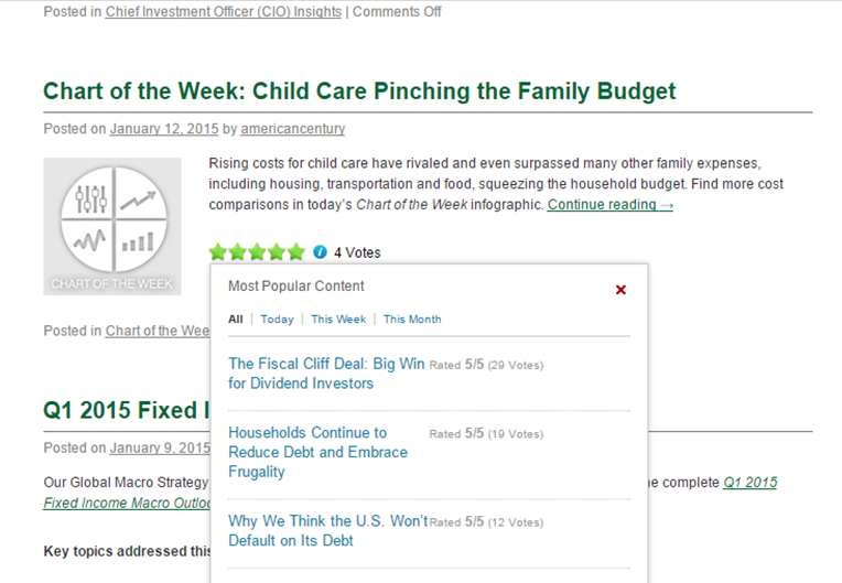
Comments may be turned off on American Century’s blog, but the social sharing counters and the popup of the Most Popular ranking support the user’s experience. The star ratings and total votes combine to provide an alternative form of navigation courtesy of previous visitors to the site—the reviews they've left behind identify what’s good on the site.       

Making Thought Leaders Accessible

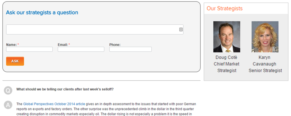
The Voya blog offers an Ask a Question feature. There’s none of the authenticity that comes with published account names, there's no date accompanying the question, the investment strategist who answered the specific question isn't named and there’s no opportunity for follow-up, which blog comments enable. It's a controlled yielding of the floor and the content focus to address what an individual reader is interested in. Despite its limitations, it has the effect of making Voya thought leaders accessible.

Not Now Doesn’t Mean Never

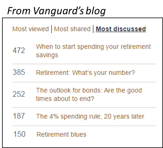
When Vanguard started blogging in 2009, I noted that comments were not accepted. It didn’t take long before comments were enabled and some visitors to the investors blog went to town. At the extreme, 472 comments have been submitted to a 2010 post on When to Start Saving Your Retirement Savings and it continues to top the blog’s Most Discussed ranking.

Vanguard accepts comments on its advisors and institutional blogs, but commenting there is much less common. 

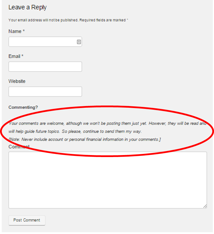
As shown below, Franklin Templeton's Beyond Bulls & Bears blog and a few other firms collect comments while acknowledging they won’t be posting just yet.

Twitter Widgets—Yes, But…

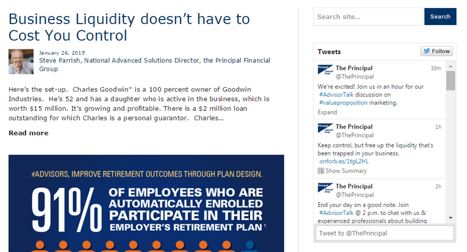
Several firms publish a Twitter widget on their blogs, which would seem to be a low-friction way of presenting commentary from other parties. However, this screenshot from the Principal blog is typical of all embedded tweets that I’ve seen published on asset manager domains. The feed is of the firm’s tweets only as opposed to all replies or mentions. This isn't surprising, there’s no telling what kinds of commentary would be published on an unfiltered feed.

But there's another consideration, too. A Twitter widget embedded on your own site can point visitors to content that you shared either on your site or off. By contrast, the interactions your account has with others would be less valuable and may be less effective in prompting people to follow the account. Even when configured to show just your account's tweets, though, the presence of a Twitter widget suggests the firm's participation in and even availability to the community.